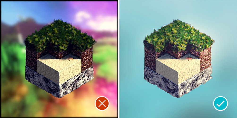
Have you ever wondered why some images are truly delicious, and the other look “oh no”? The answer is simple, it’s composition mistakes that cripple our renders.
These wicked gremlins bite your composition legs, and punch its butt.
Basta! Time to fight the gremlins.
In this tutorial you’ll learn the 13 most common composition pitfalls (and how to avoid them).
Composition Tutorial: Top 13 Mistakes
What you’ll learn by watching this video tutorial? Here are the most basic and common composition mistakes, that we do so often. This list is based on the example of the Art Review Session with Guilherme Henrique, Reynante Martinez and yours truly.
I thought that it will be cool to summarize the main points in a quick video tutorial. If you feel that these tips will be helpful to someone you know, please share the post. Just click the share buttons below and above.
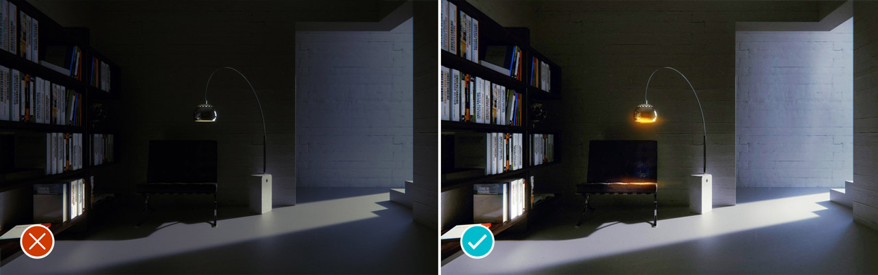
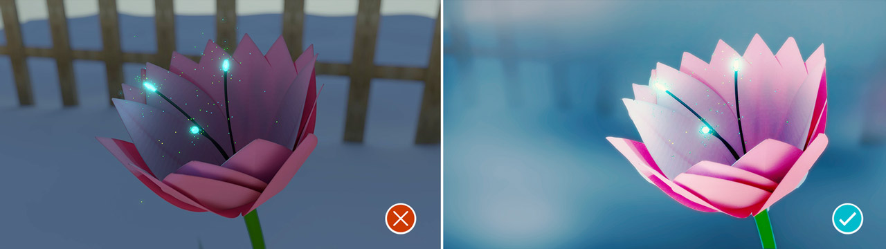
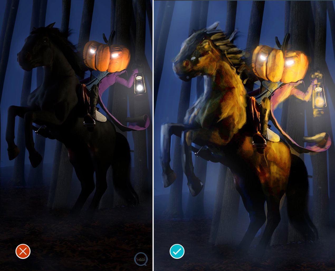
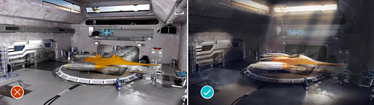
1. Too Dark
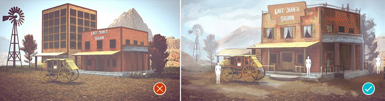
2. Framing is Off
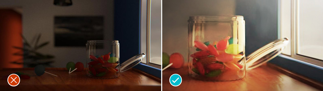
3. Where is the Point of Interest
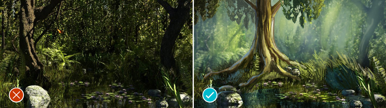
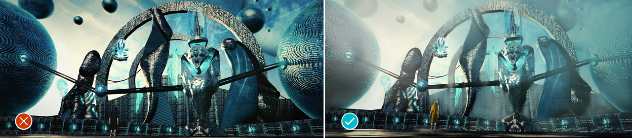
4. The Figure Doesn’t Stand Out
5. Too Centered
7. Too Many Lights
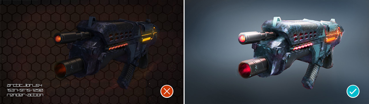
8. Not Enough Variation
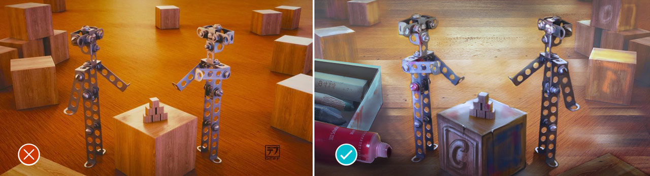
9. Mooooar Details!
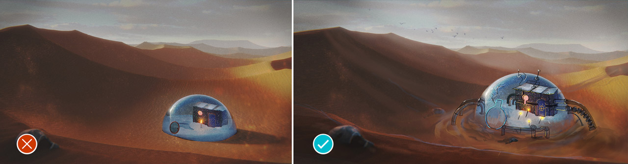
11. The Scale Problem
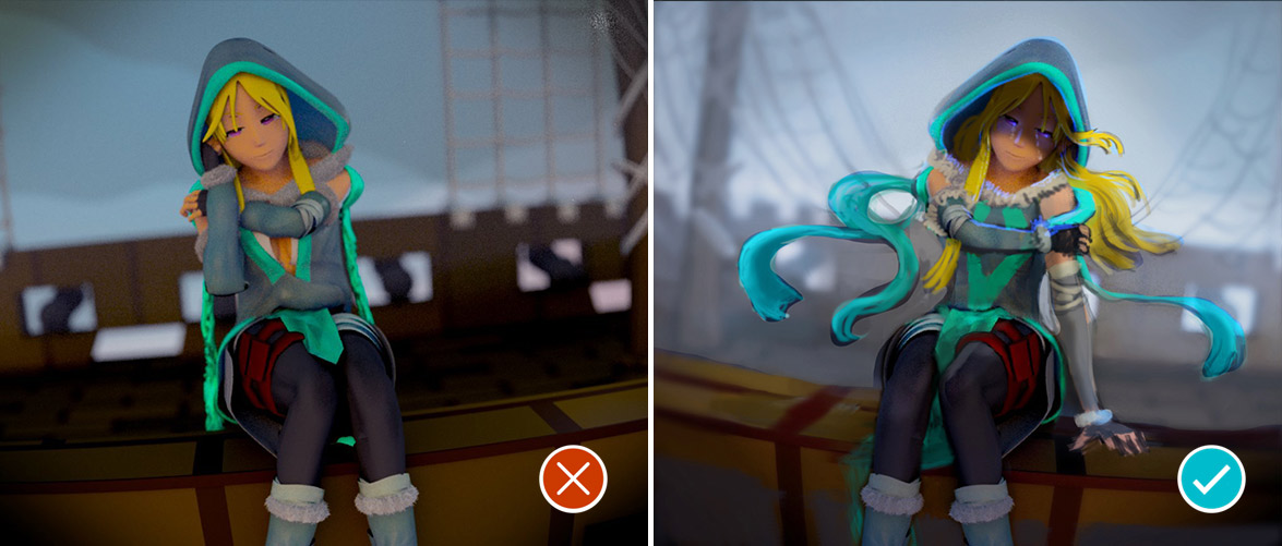
12. Too Static
13. Too Noisy
[space size=”35″]
Art Review on Reynantemartinez.com results
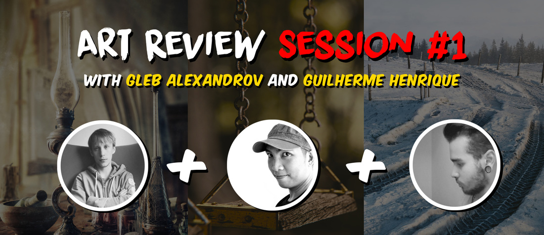
If you want to follow through all the works and comments posted on the Art Review Session, check out this link.
Thank you for making this event bombastic and great.
[space size=”35″]
What is Your Most Dreadful Composition Mistake?
Join the discussion and answer this question: what’s the most dreadful composition mistake? Or what’s the mistake that you make most often?
What mistake poisons your works?
Share your thoughts below, and you can illustrate it with pictures!
[space size=”35″]

Ancestor
Very useful, thanks!!
lombre33
thx ! Simple and Easy to understand 😉
(and there is my render lol ^^)
-L0Lock-
ouep… Sois heureux! 😀
Gleb Alexandrov
Good to know that, thnx.
Yitzi Litt
Thank you for yet another awesome tutorial!
I participated in the critique session, and this is the (hopefully improved) result that I came up with; I would love your opinion on how to take it to the next level.
Again, thank you!
Stephanie
This scene could use a point of interest (See number 3).
Uncle Snail
Super great! I’ve been trying to pick up on more composition/color tips, which is something I think we often miss as 3D artists.
Gleb Alexandrov
So true, man. Composition all the way.
M ALI Subhani
Its Fantabulous thanks <3
David Mcsween
Biggest fail I recall (I’m old and forget crap work to easily), was a rebrand for a state wide network tv program. My crime? Making it far to busy. And not starting with a clear concept. I just started playing until i thought it looked cool. The client wasn’t visually articulate so they couldn’t critique properly. Every time I see my old show reel I cringe. The title package lasted 2yrs IIRC
Rattany
Hey Gleb ! Thank you a lot for your lighting and composition tips ! i wanted to share with you my lastest render trying to follow thoses 🙂
https://www.artstation.com/artwork/3wg4E
Anders Thøstesen
Better?
Oliver Garcia
Haha Thanks for using my render, I’ll keep in mind for the next time. Thanks again for reviewing it!