Get the Typography Geekmaster achievement by following these 10 typography and design rules for beginners.
Typography and design is ingrained in our lives. Whenever you create a thumbnail for your new Youtube video, or design a wedding postcard, or post a demotivator to Instagram. Why not take it to the next level? There is a handful of typography best practices, so let’s take the full advantage of them.
Initially I’ve been writing this list for my friend Eugene, but then I thought that it will be useful to all other nerds across the globe.
So before we get started, feel free to retweet.
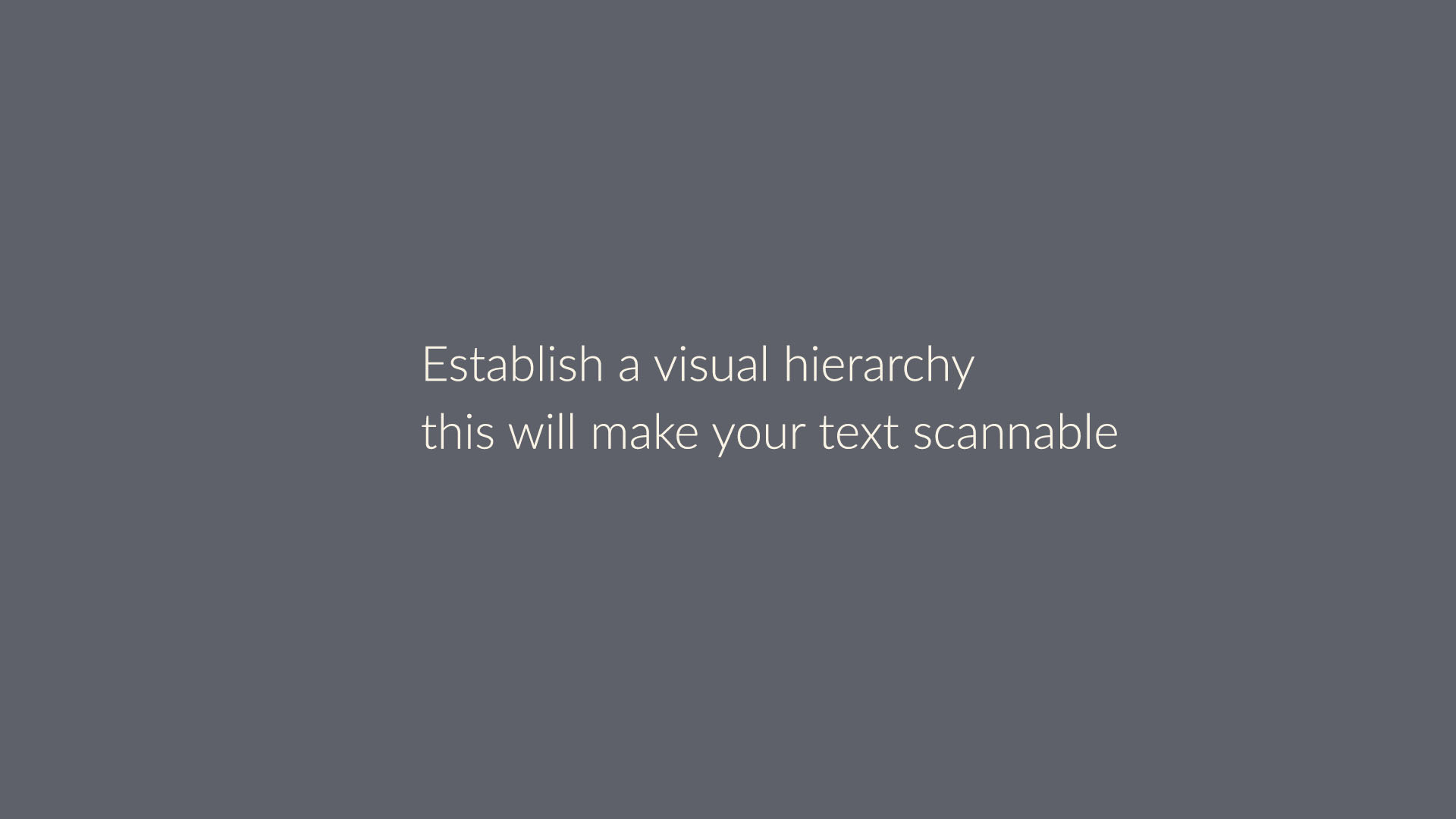
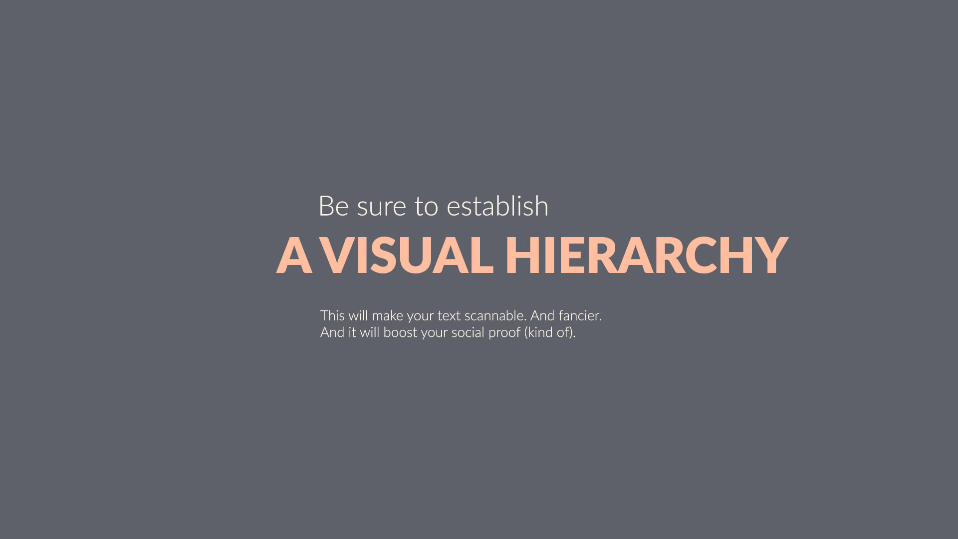
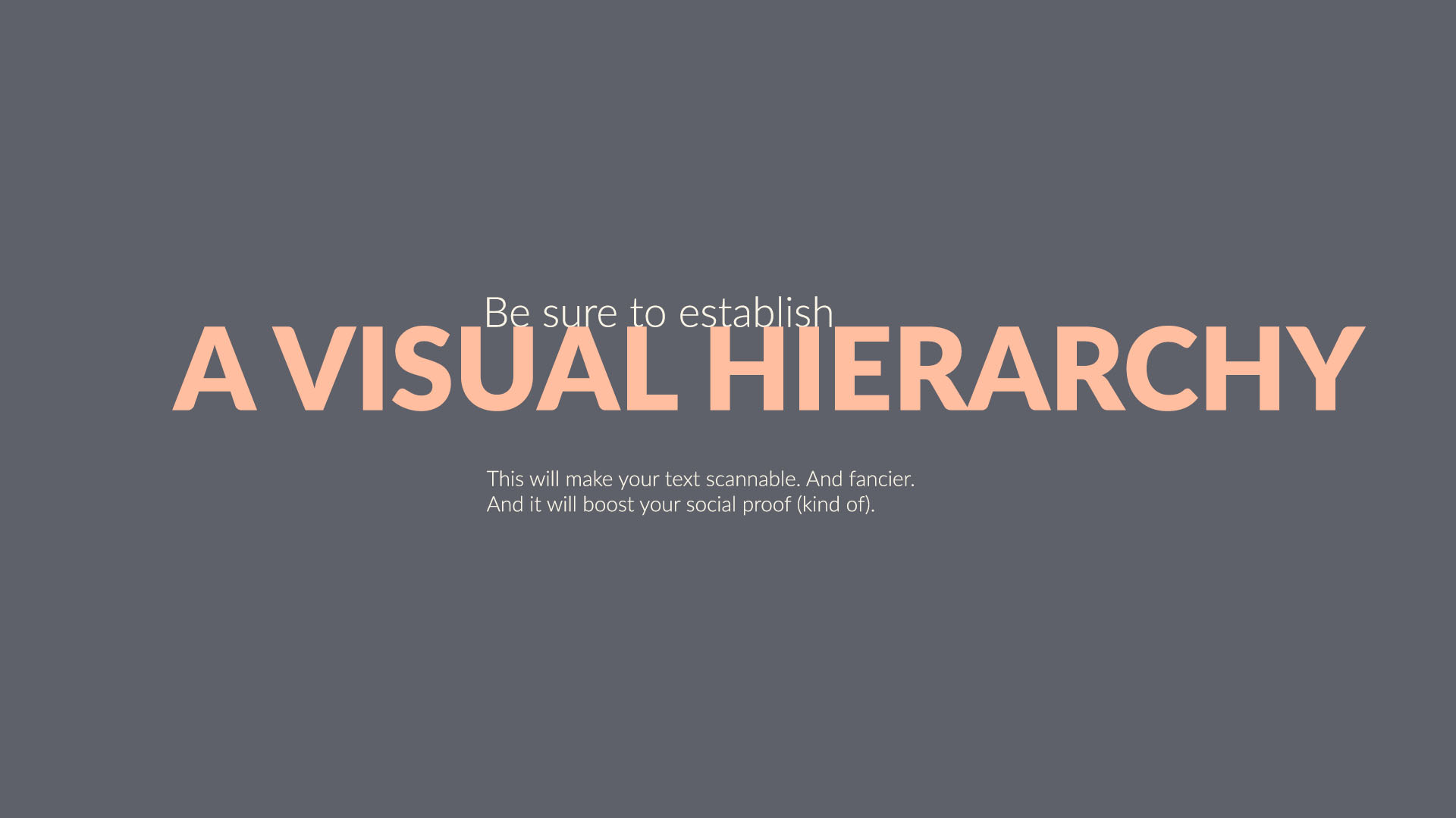
1. Hierarchy
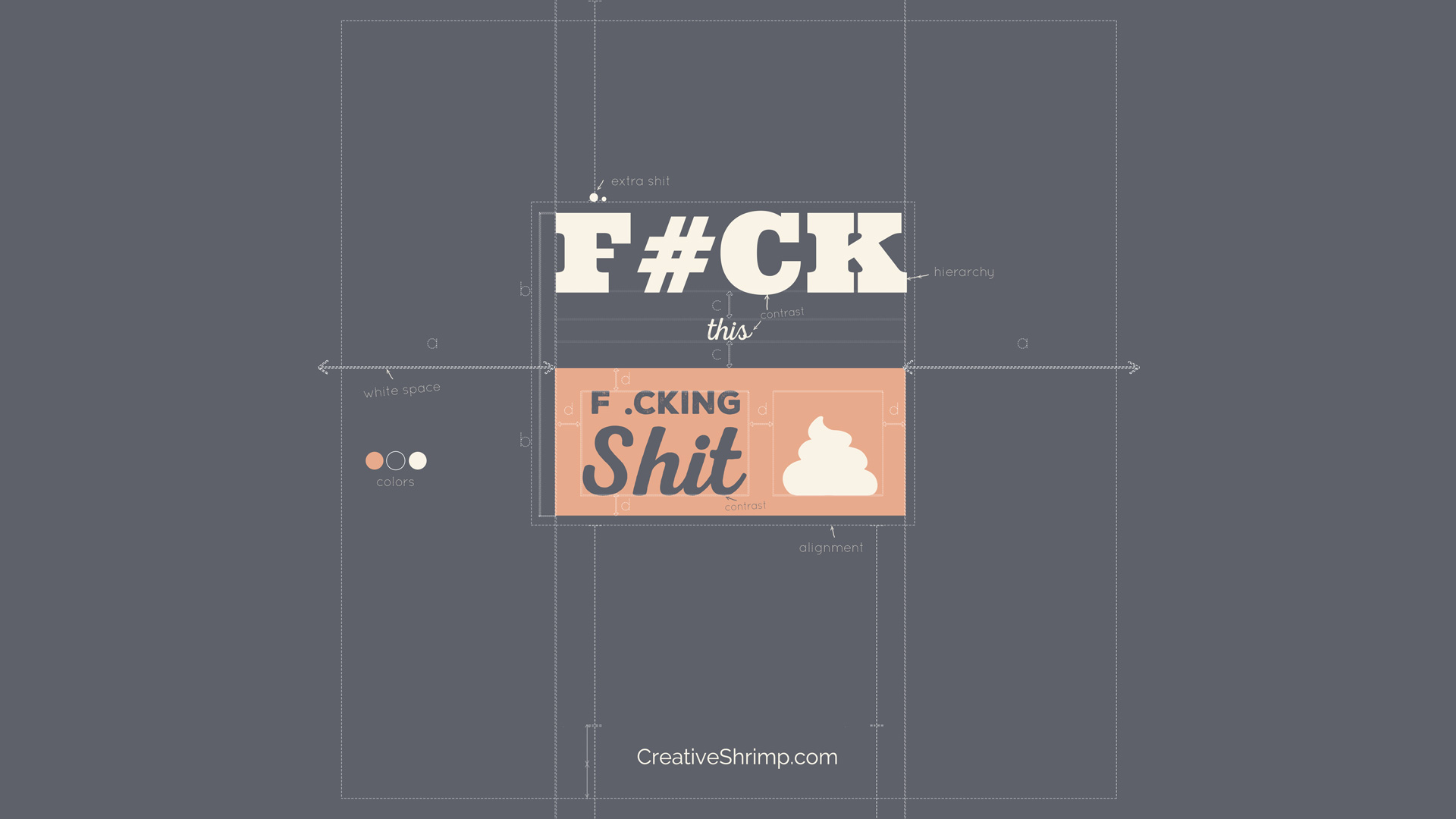
Establish a visual hierarchy to make text scannable. Ask these questions. What’s the key part? What part of the message should really pop? In what order do I want this to be read? How can I make it easier for the reader?
Just by resizing the elements you can phrase a bold, easy to read copy.
There are numerous ways to establish hierarchy: contrast, color, size, weight, layout. We’ll be discussing all of this, so keep reading.
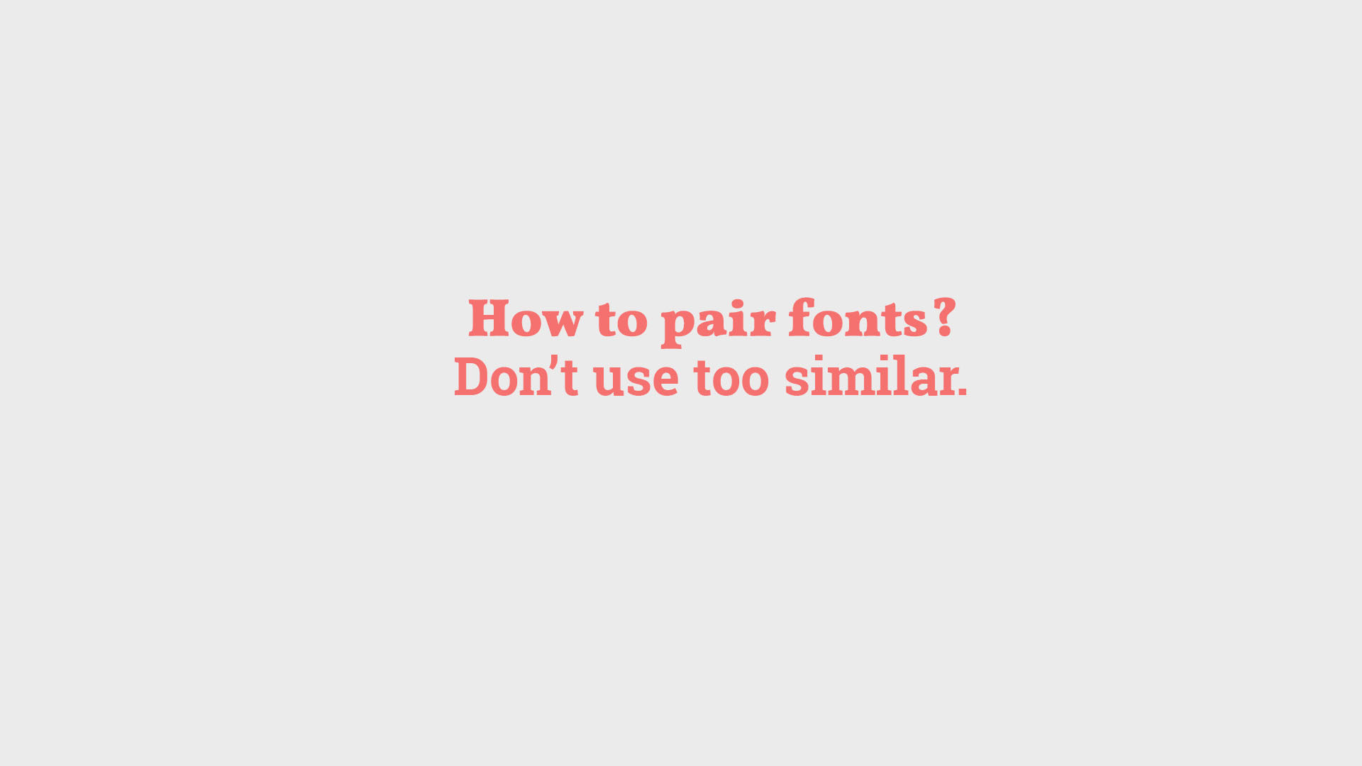
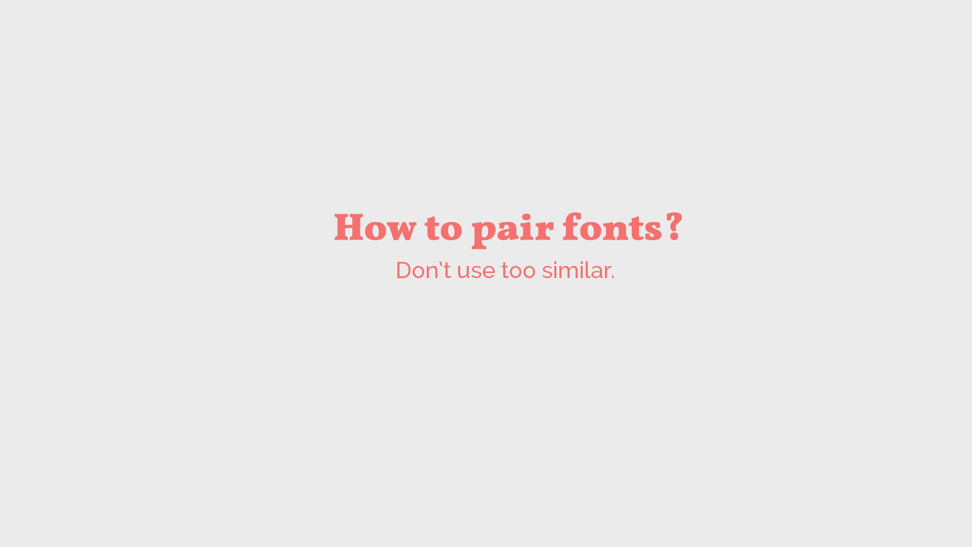
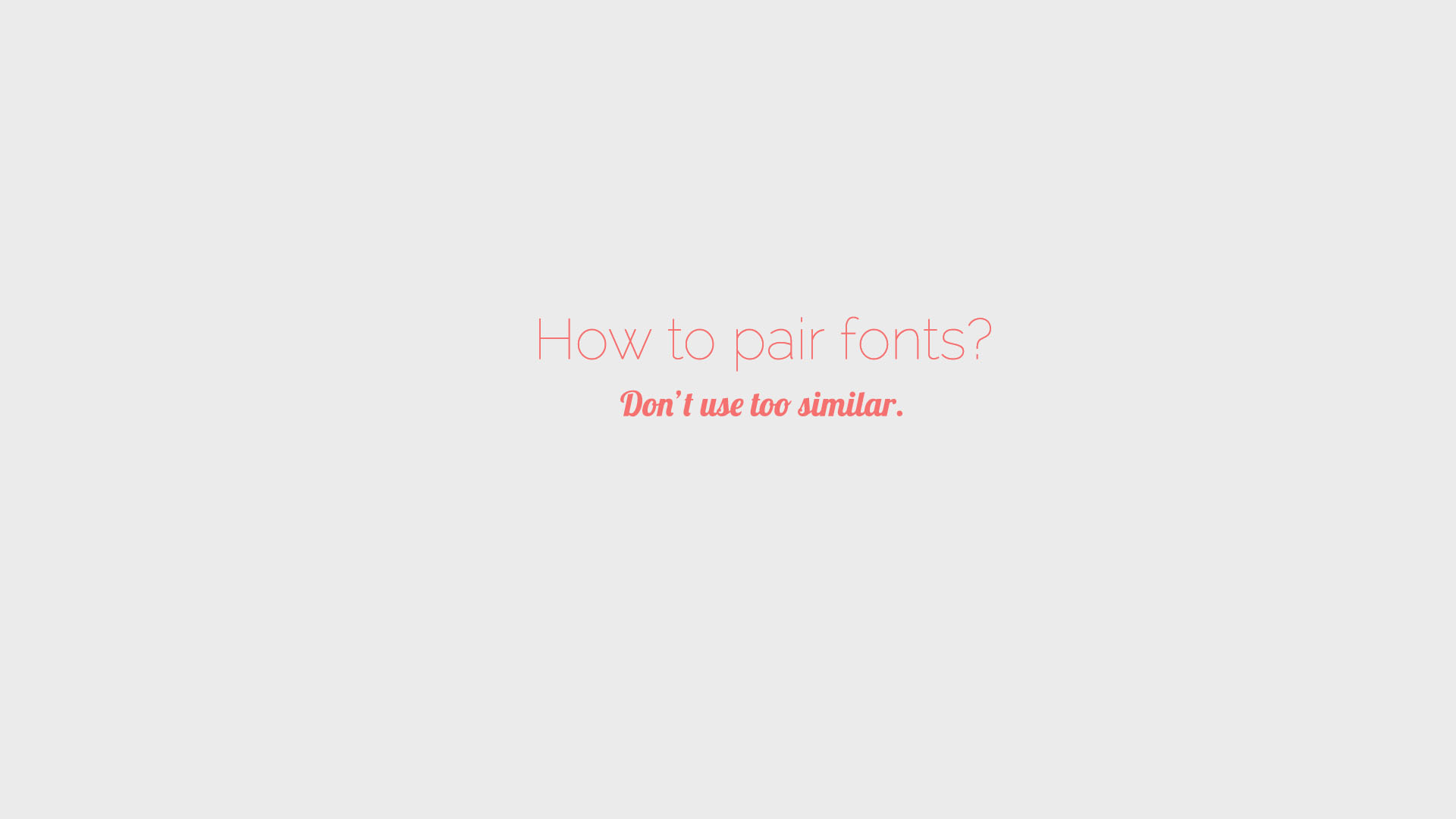
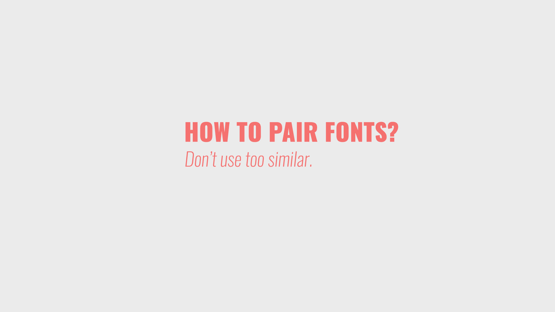
2. How to Pair Fonts
Pairing fonts is part technical and part intuitive process, just like art. Let’s say that contrast is the glue that holds two fonts together. If the fonts are too similar, it requires a lot of brain power to spot these tiny differences. It’s uncomfortable.
So, our eyes hate ambiguity and love contrast.
Now what does it mean?
1. Stay away from pairing two Serif typefaces. It’s better to pair Serif and Sans Serif (the one with the serifs, and the one without).
2. Be careful with the fonts of a similar weight. It’s much better to pair super heavy and hairline, than bold and semi-bold.
Other ways of adding much sought-after contrast is tweaking the tracking (space between characters). Or you can try pairing the radically different styles, for example Sans Serif and Hand-written Script.
Useful Link: Mixfont, a modern AI-based font pairing generator
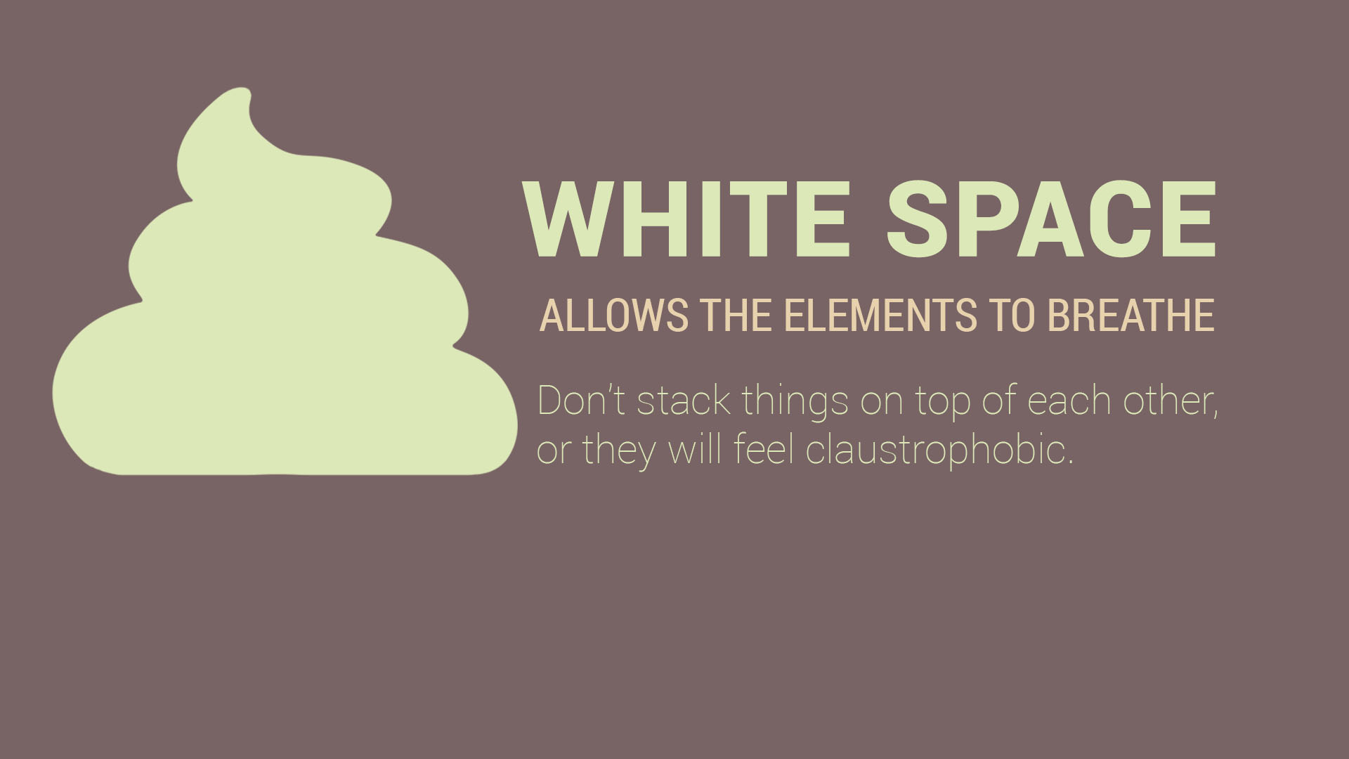
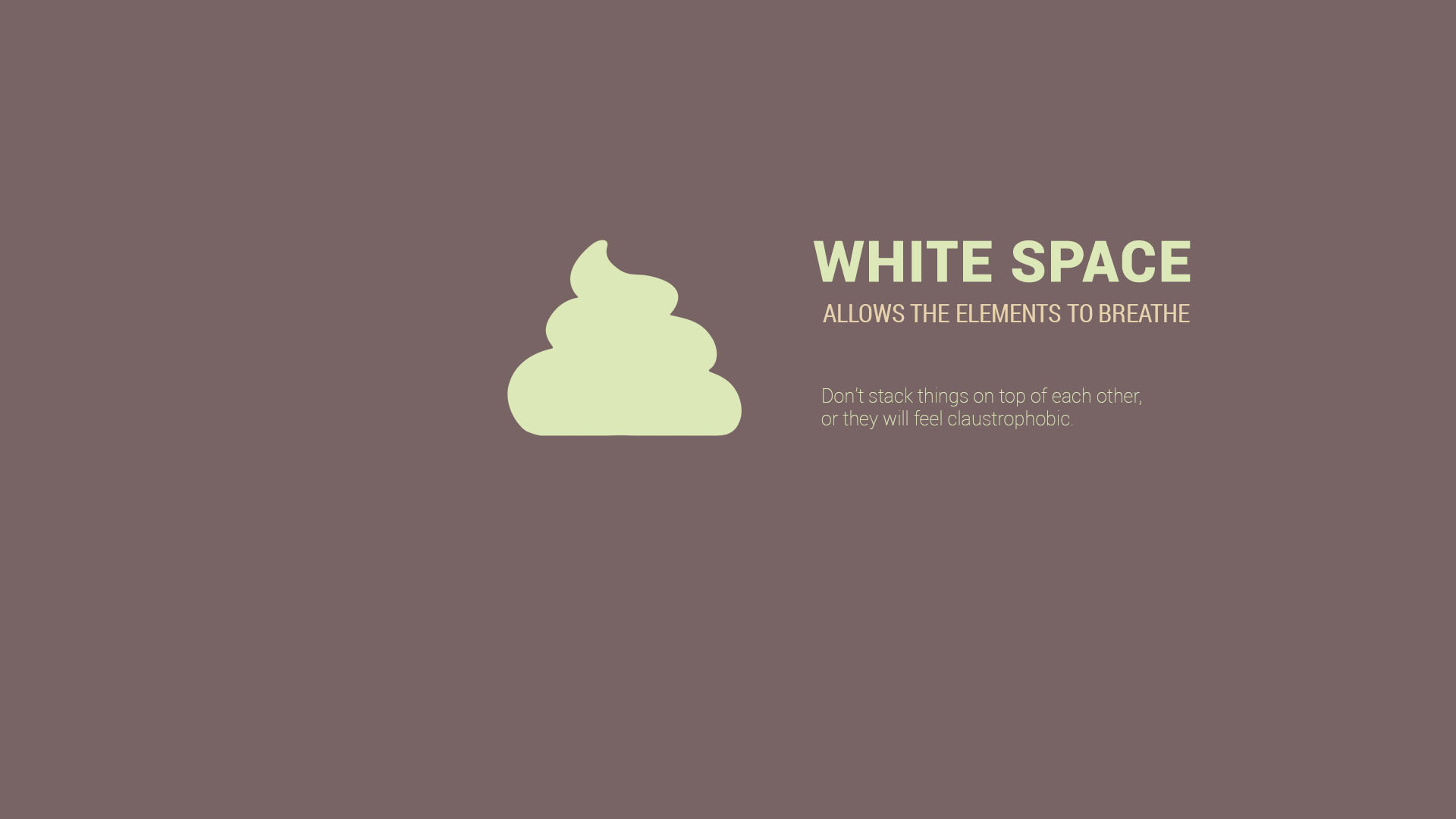
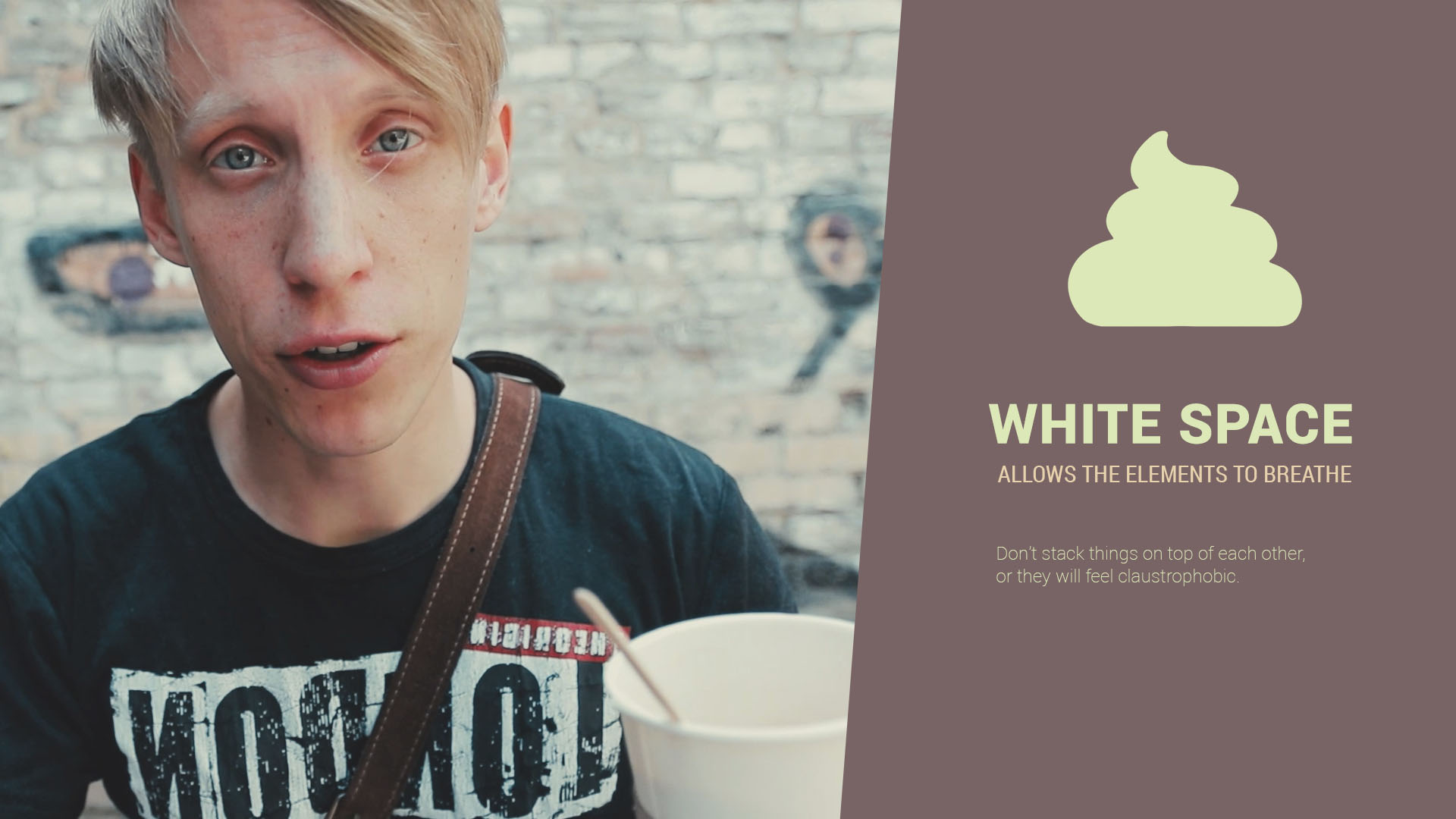
3. White Space
Design elements need some air to breathe. Separate the blocks of text by adding the empty (or we say white) space in between them. Mind the margins and stay away from the edges of the image.
Clumping design elements together is easily one of the most common typography mistakes, so be aware of it.
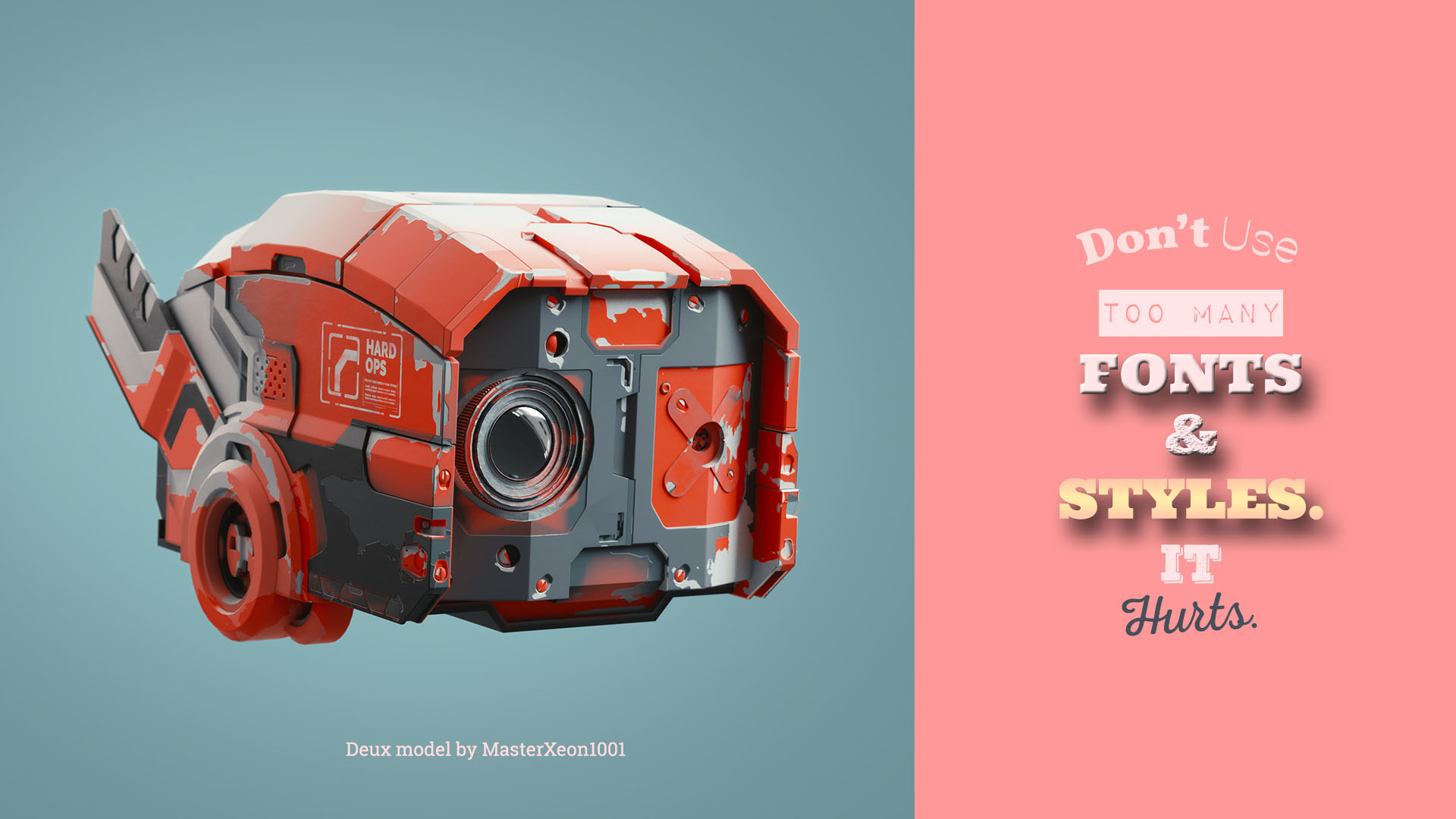
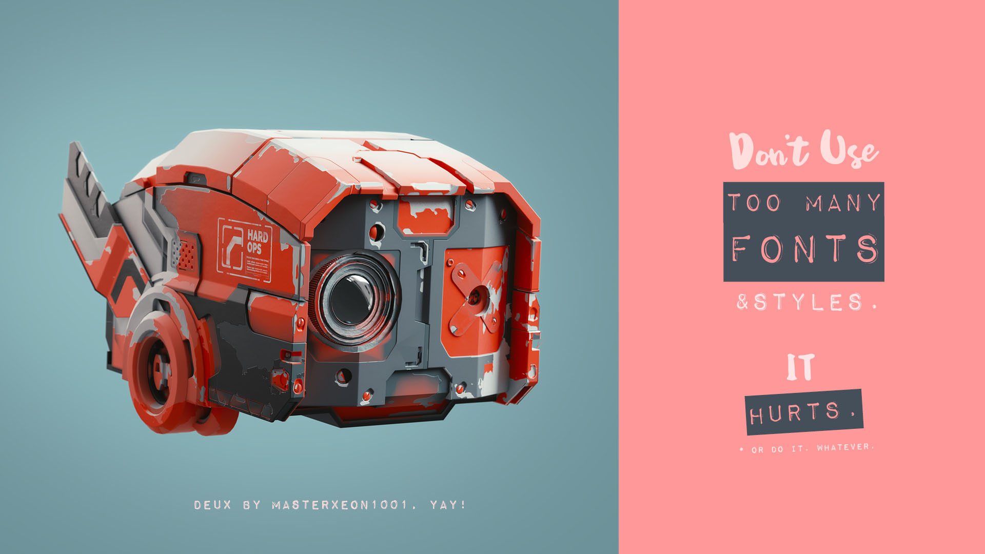
Quick tip: Use more than two fonts only if you are forced to.
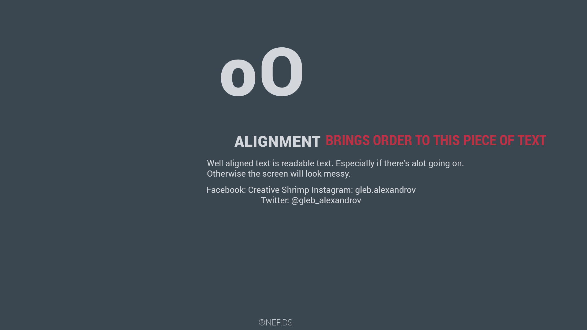
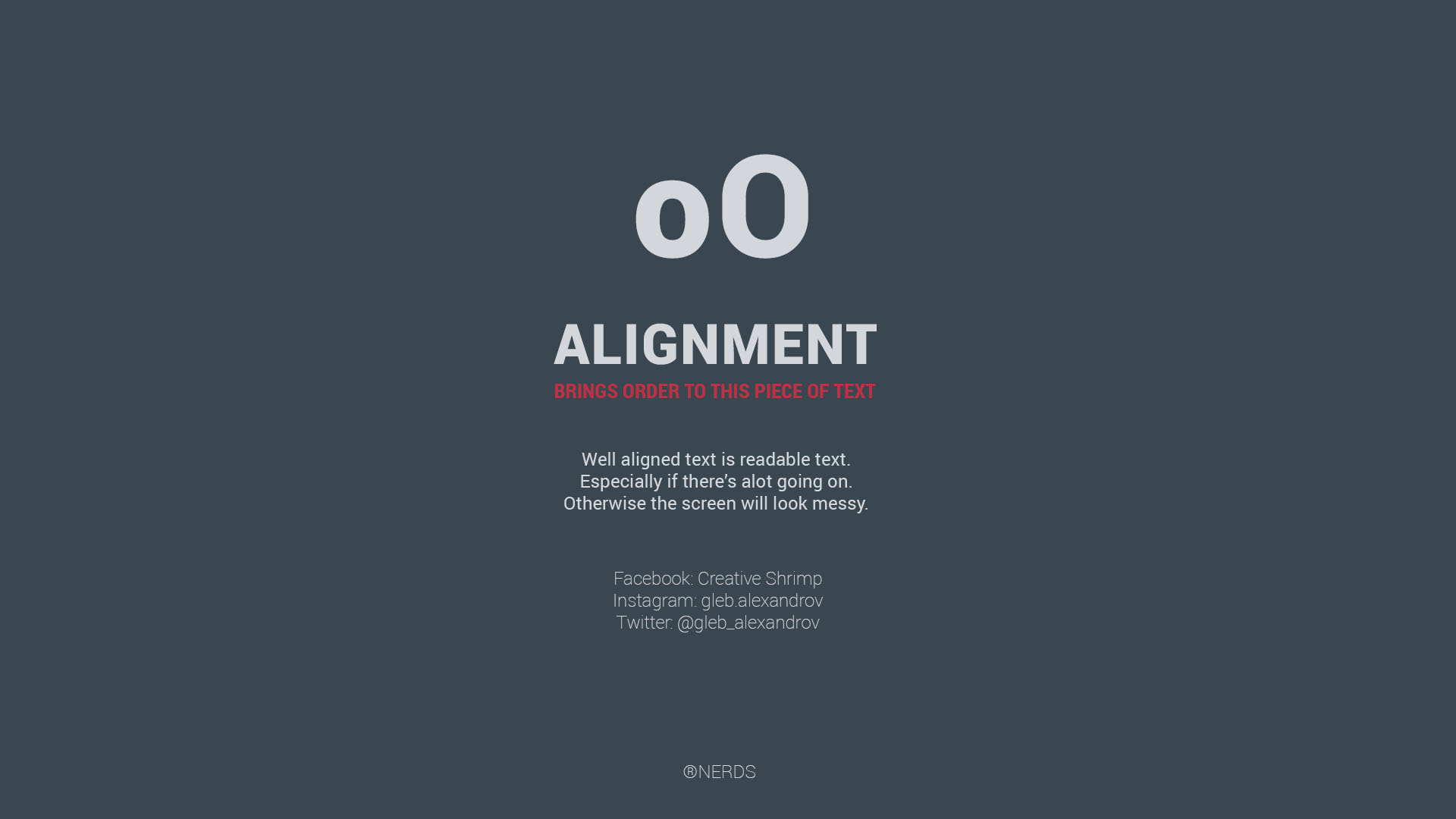
4. Alignment
For easy reading, make sure your text is aligned in an orderly way. A good way to approach it is to group the elements based on their logical relationship. A header and a subtitle can be put together while the social media links can be merged into their own block.
Be consistent with the alignment. Draw an imaginary grid that sticks on top of your design. Then align the elements according to this grid. Avoid the parts that penetrate the outer walls of the grid. Align the most of the elements to the left, center or right side.
Ask yourself, what would Forrest Gump do? Often the simplest solution is the right one. Say, just left-align everything.
Quick tip: White space is a crucial part of alignment.
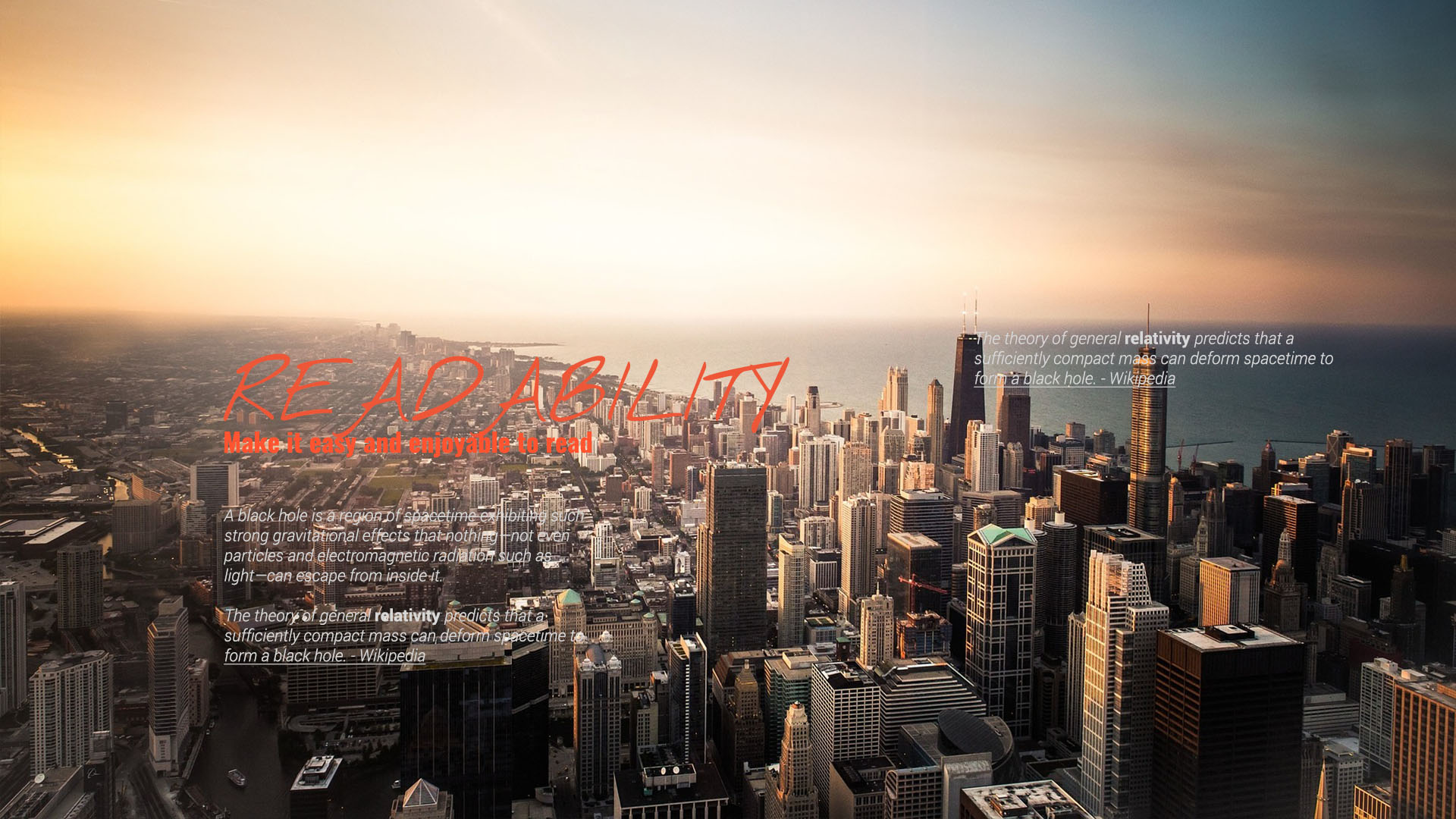
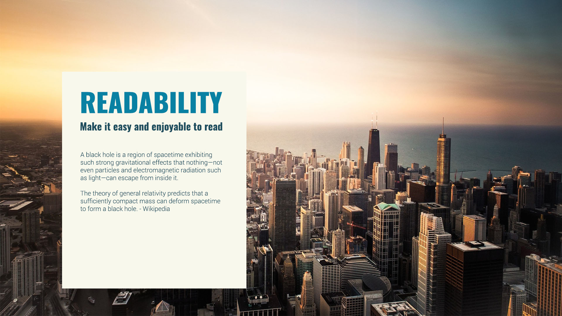
5. Readability
The point of typography is to make the copy readable, not only fancy. Who wants to stare at gobbledygook (well, exceptions matter, but anyway)?
But what does readable mean?
The text is readable when it has the following:
1. Contrast, especially value contrast (difference in brightness, as opposed to difference in hue or saturation)
2. Appropriate tracking (space between characters)
3. Appropriate leading (space between baselines)
4. A typeface without bells and whistles
5. Sufficient size
6. Noise-free background
7. White space around

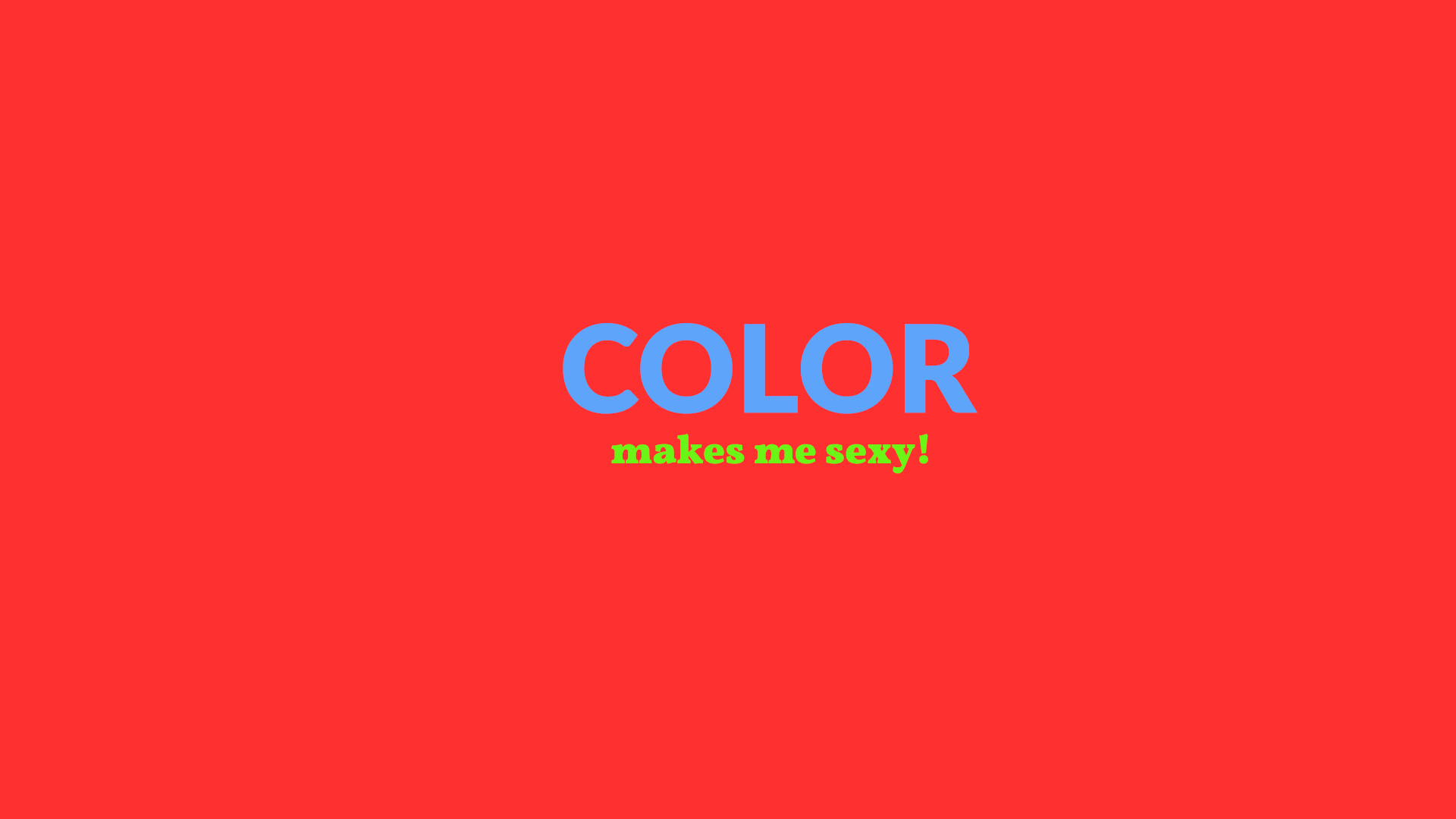
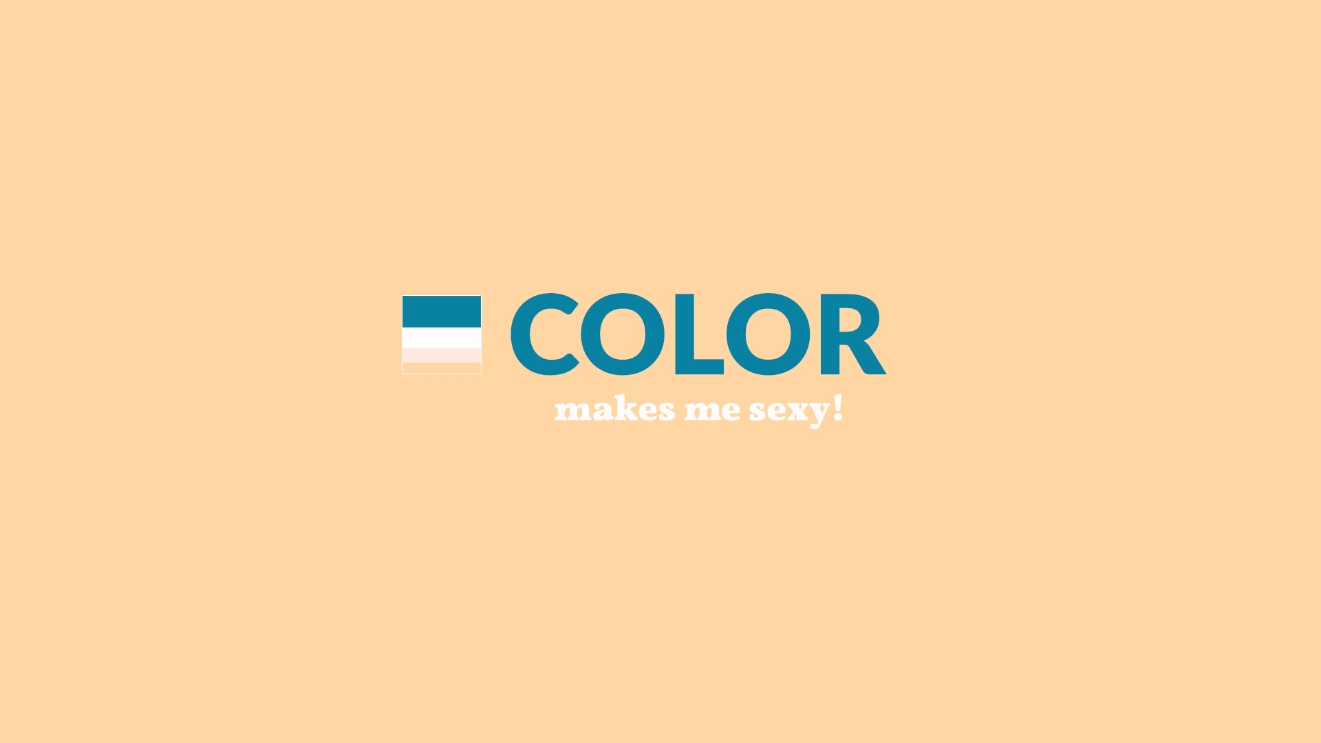
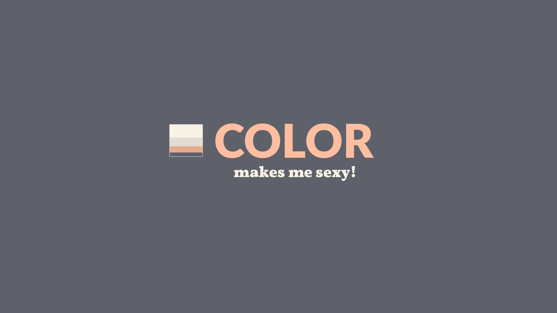
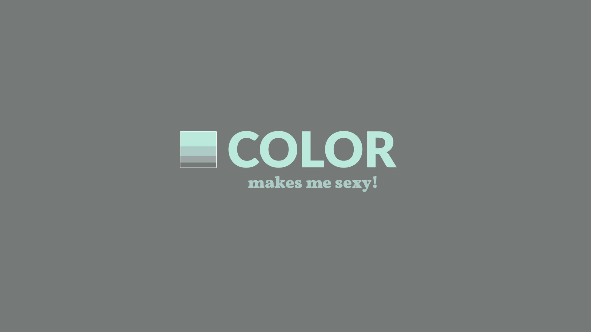
6. Color
If you want to succeed in typography, learn the basics of color theory. What does it take to harmonize two colors? What is complimentary contrast?
There are many websites that’ll help you to fast-track your color education.
1. Say, you can visit Adobe Color CC, choose the complimentary color rule and it will show the perfectly matched pair of complimentary colors. Like the Teal and Mustard in the second example below.
2. Or you can go to ColorHunt.co and pick from gazillions of color schemes approved by the color loving community.
Oh, and oversaturated colors cause ringing effect and probably even death.
Quick tip: often, Light-Dark contrast between the text and the background is what makes the text readable. Saturation contrast is in the second strong. Hue contrast is the weakest, especially for color-blind people.
7. Contrast
We’ve already been talking about contrast. It makes things pop, it harmonizes different fonts, it makes the text enjoyable to read.
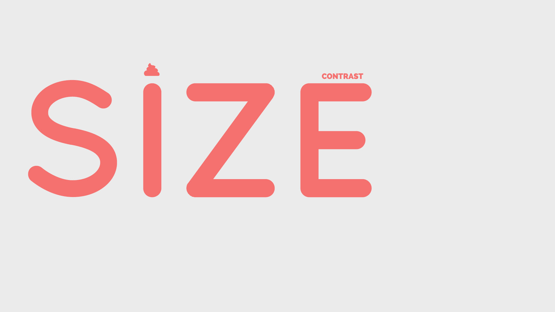
In typography, there are at least five different types of contrast that we should be aware of. Let’s name them.
1. Size Contrast
The easiest way to draw attention to an element is to make it bigger, while shrinking all other elements.
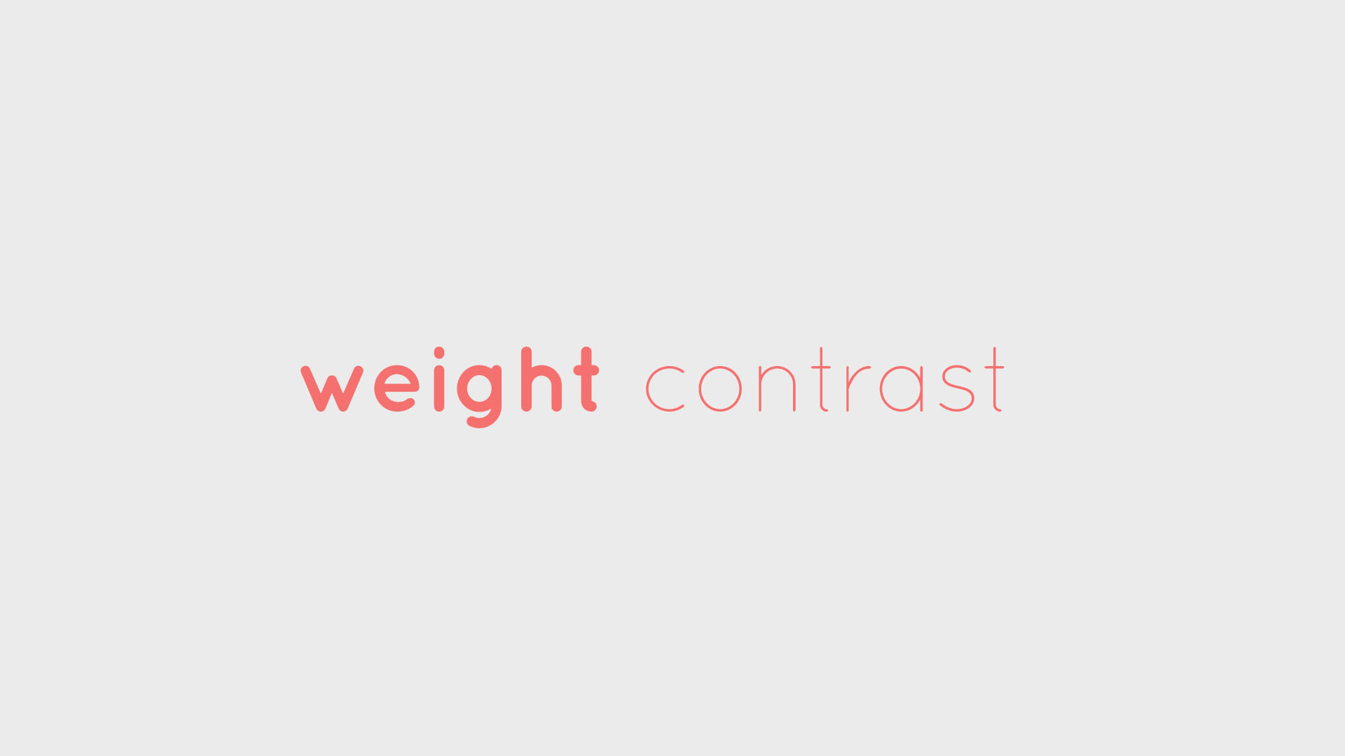
2. Weight contrast
Many font families like Lato allow you to choose from different weights, starting at hairline and moving to extra heavy (with 4-7 stops in between).
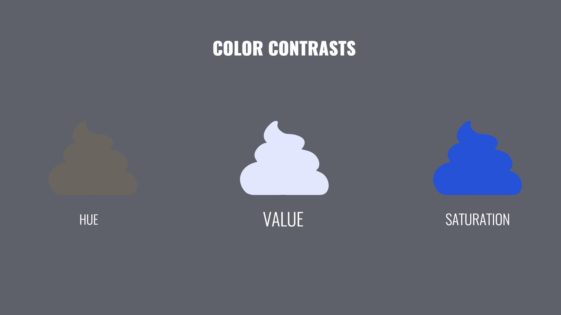
3. Color contrast
In creative typography, color contrast is your friend. We can split it into three contrasts: by value, saturation and hue.
Arguably, the most prominent one is value contrast aka Light-Dark. It renders things readable and vice versa.
Another contrast we can use is saturation, imagine the difference between the sunset red and the pale shrimpy pink for example.
The hue contrast tells us how far apart are the colors on the color wheel. It’s less intensive then the Light-Dark contrast.
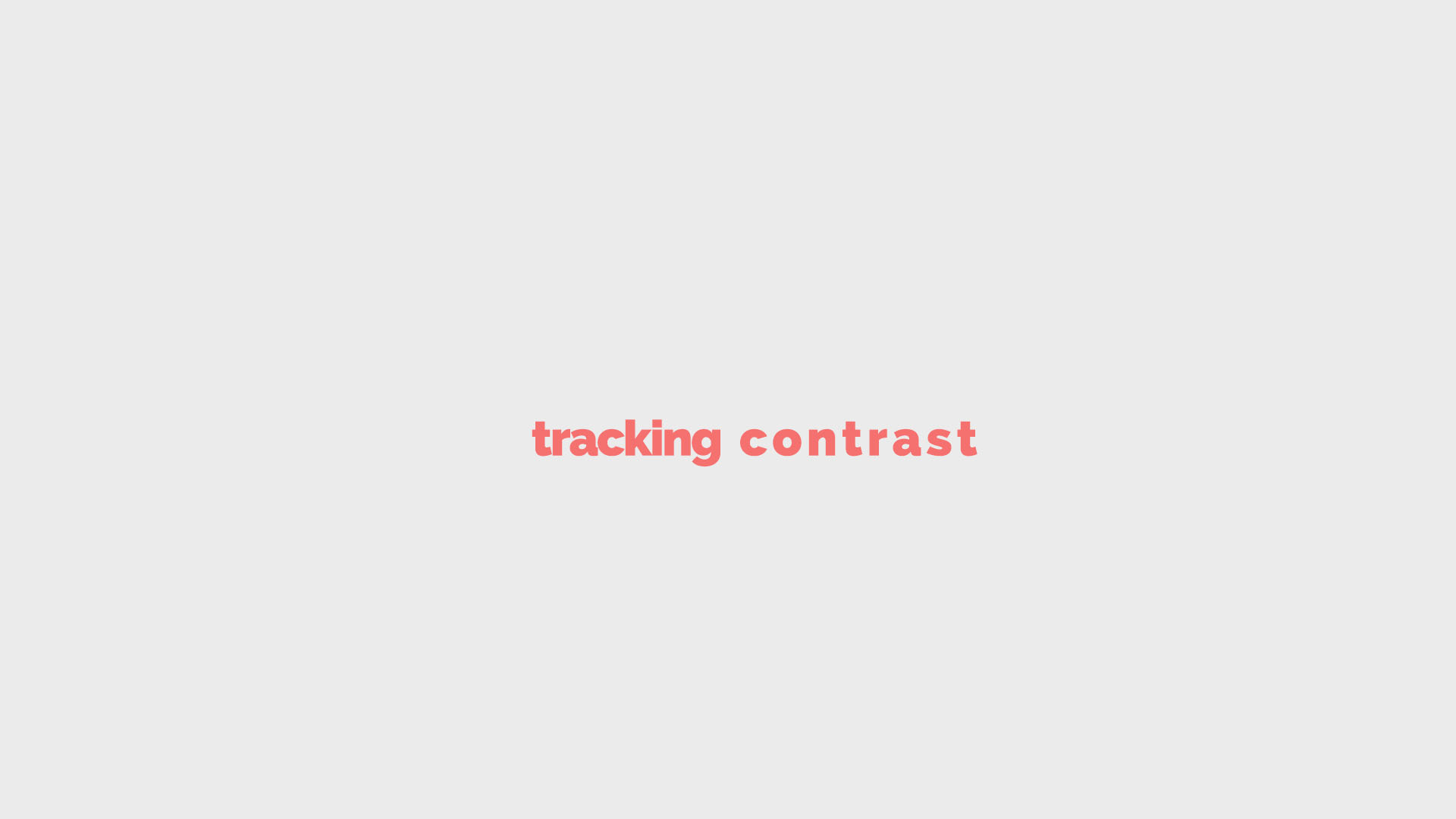
4. Tracking contrast
One less common way of adding contrast is to play with tracking.
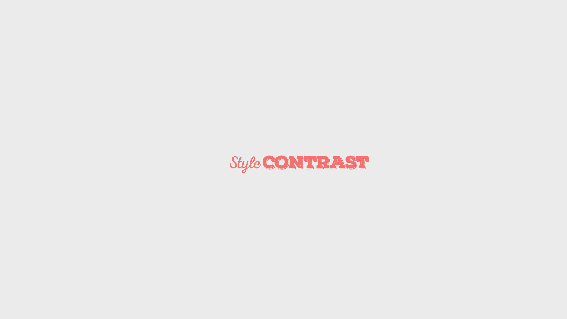
5. Style contrast
Try clashing different styles for a frivolous typography which doesn’t give a damn. For example, hand written Script and monumental Slab.
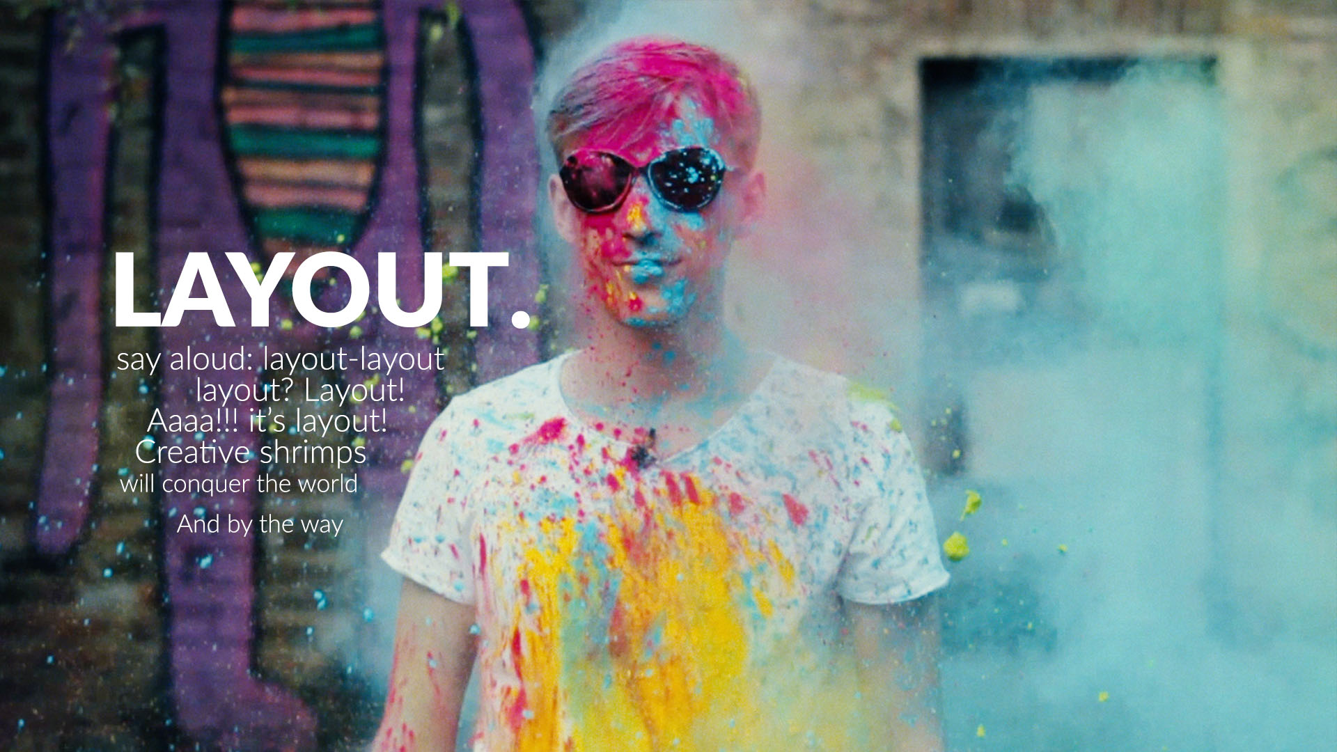
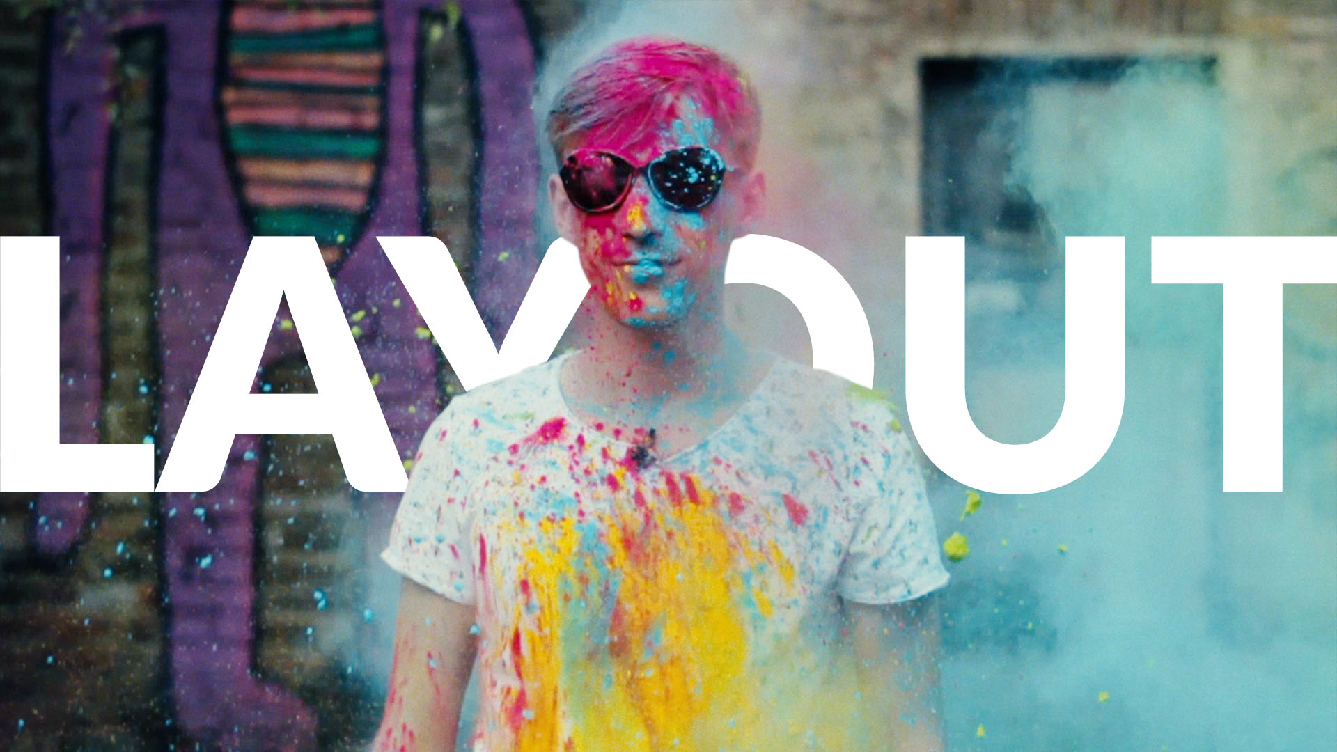
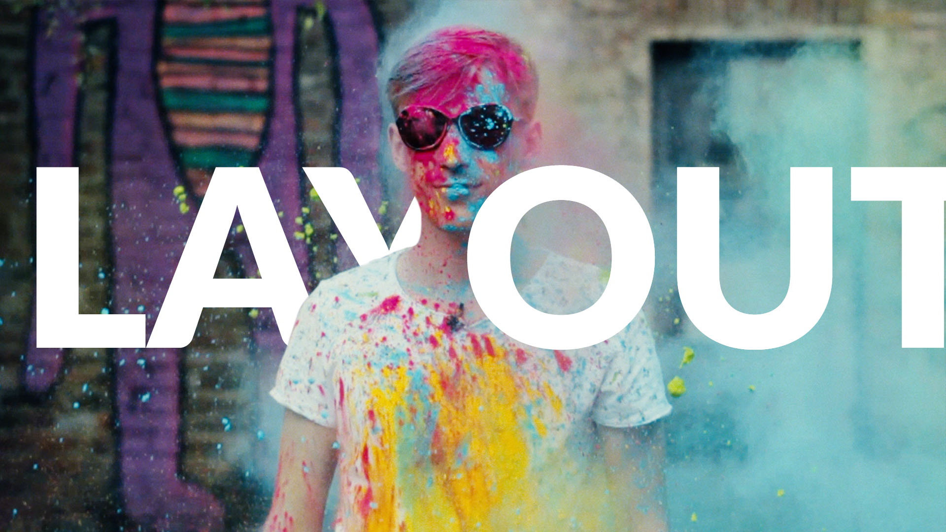
8. Layout
Text layout in typography is how you arrange the text on the page (or rather in the image). Pretty wide definition? You bet!
Picture this. You‘re looking at this Gleb’s photo and weighting different possibilities in your mind. Hmm, where do I want to place the text? Do I want it to flow around the Gleb’s left shoulder?
Or maybe I want to slap it up the back plate? So it kind of stays behind the figure?
Or just arrange it in a simple text box?
This is layout. It’s a good practice to make sure it plays with the image somehow.
9. Consistency
As any typography nerd will tell you, consistency is gold. Be humble, stick with no more than a couple of fonts per image. Limit the cheesy effects like shadows, outlines and gradients.
These self-limitations don’t cripple the creativity as it may seem. On the contrary, they fuel our creativity engine by making us choose wisely.
Use repetition and stick to one visual language throughout the design to avoid clashing styles.
And finally, keep it simple stupid (KISS).
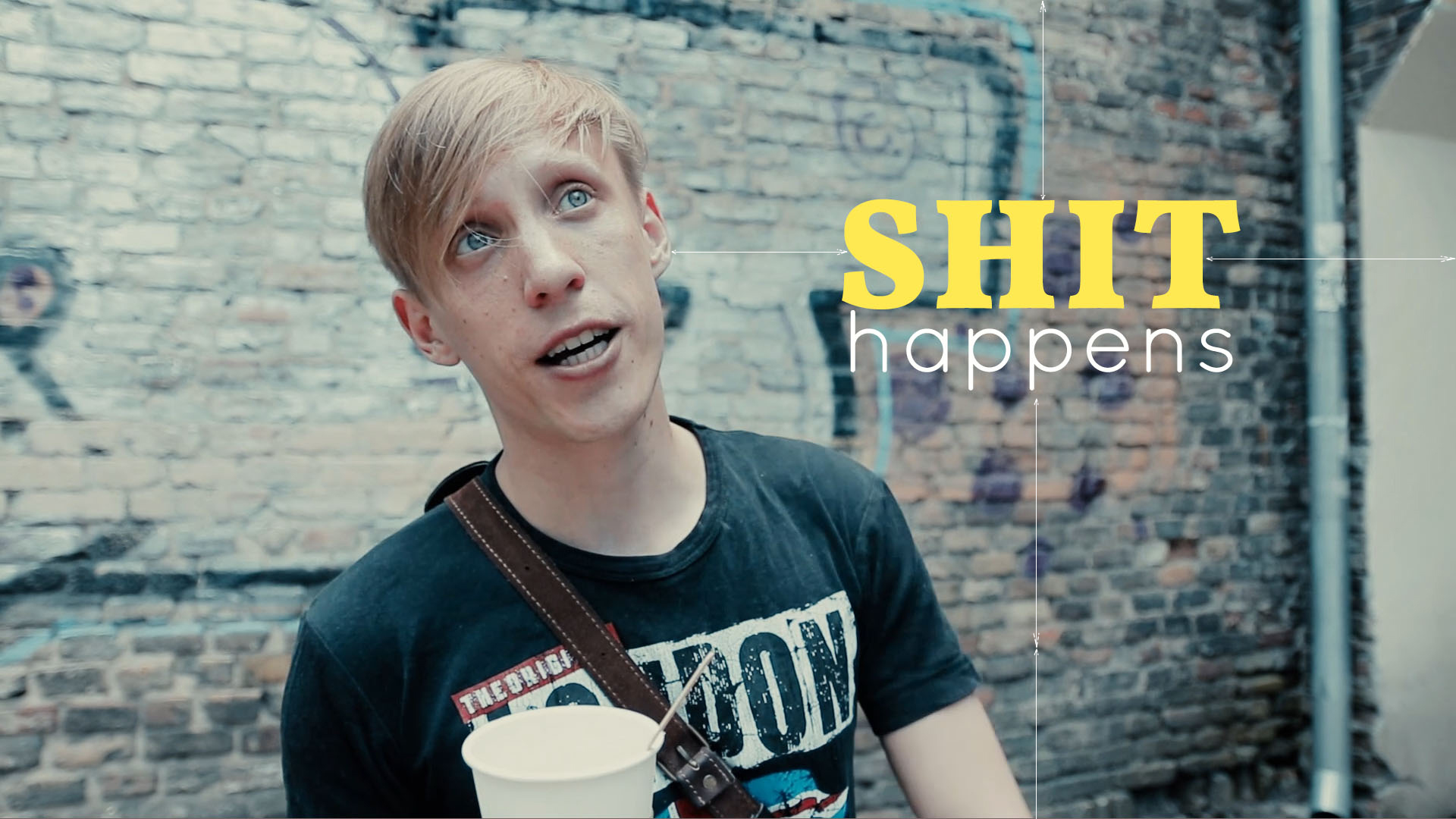
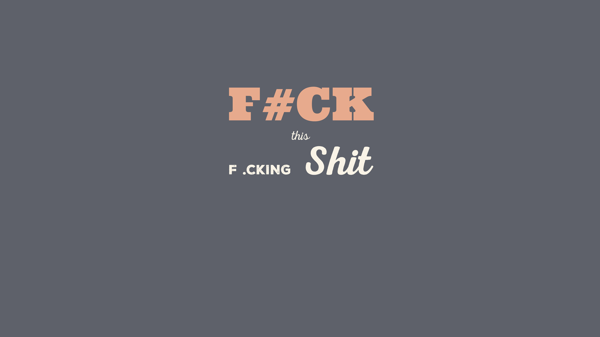
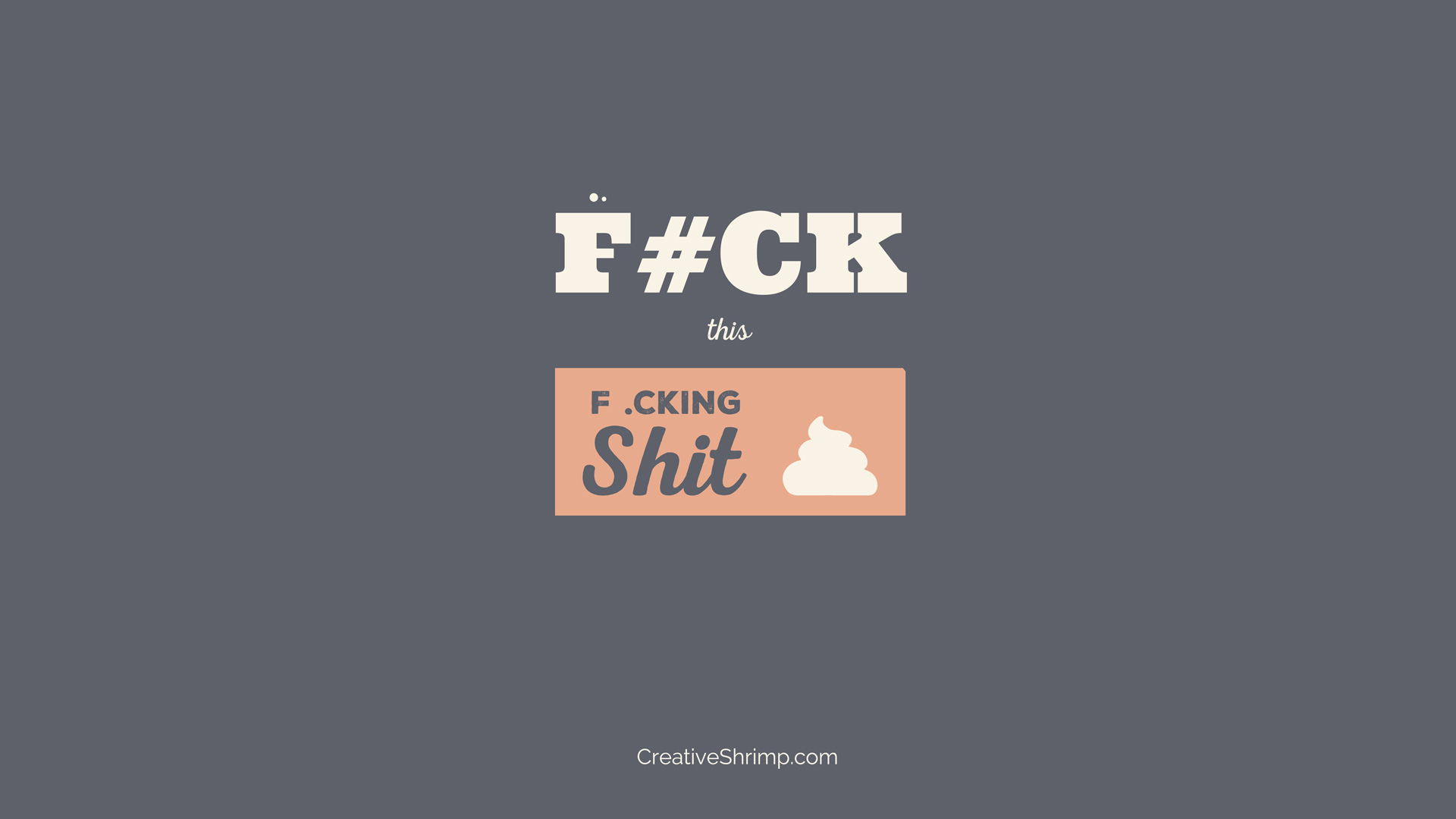
10. Extra Variety
As a finishing touch, throw in some extra chocolate chips. It can be anything, as long as it adds to the Oomph factor:
1. Labels
2. Icons
3. Lines
4. Hand-painted elements
5. Modified symbols (reversed V letter instead of A)
6. Tiny irregularities (chopped angle, extra dot beneath the I letter)
7. Use non-textual elements to bring the extra cool to your typography.
Over to You
Now Eugene should be well equipped to storm the typography front door. What a shame he’s lazy as hell, but other than that a good fellow.
Thanks for scanning through this typography tutorial. Now test these tips by making some fancy thumbnail, flyer or postcard!
Also if you wonder what are the fonts that I used, here is a list (all of these fonts are free for personal and commercial use): Lato, Roboto, Roboto Slab, Vollkorn, Nexa Rust Free, Ultra, Impact Label, Lobster, Oswald and Raleway.
If you know someone who may benefit from these typography tips for beginners, drop them a line! And better yet, share it on your Facebook and Twitter now. I’m dying to see this post getting 1000 shares and 1mln views!

Abraham Mast
Awesome, thanks Gleb!
Gleb Alexandrov
thank you Abraham! Now do you feel motivated to put together some poster or flyer? 😉
Abraham Mast
Oh yes it does! I am actually going to a design college this fall, so I am going to creating lots of typography! 😀
Reda Lamine
Awsooome Abraham good luck with that if you need anything let me now please 🙂
Johnson Martin
Good stuff Gleb. Design is such a fun topic to explore. 🙂
Gleb Alexandrov
Design is a kind of an all-encompasing mega topic. we can probably record a gazillion tutorials and still barely scratch the surface. Lots of exploration! the uncharted territory.
jose betancur
Awesome Gleb! thanks for this tips, it would be awesome to see a typo tut for blender 😀
Awdie
Thanks! This is awesome
Reda Lamine
Hello Gleb I really liked the video I’m a digital artist I’ve used a lof of fonts when I was in school 🙂 folks if you need more tips for typography I can help you with few knowledge I’ve learned
Note: I am not a professional I just love sharing and exchange knowledge with all of you SHRMIPERS 😀
BoomGoes DYNAMITE
Really
LIKED
It
Maidul
Really enjoy this article.
Pingback: Tips dan Trik Teknik Typography Agar membuat Desain Anda Lebih Baik | Bikin Now
Pingback: Typography Tutorials for Beginners – elviaramos
Santosh Nirankari
It was quite helpful, thank you. You should try to spread this and stuff.
Try hackr. https://hackr.io/tutorials/learn-typography
Pingback: 7 Ways to become a better Graphic Designer or Web Designer |
Suresh Dasari
Thanks. Good one.
Regards
Tutlane.com
Pingback: 7 Ways to become a better Graphic, Web or Digital Desiner (or any type of designer) |
Pingback: 10 Typography and Design Tips for Beginners | Host your Website
Pingback: 10 Typography and Design Tips for Beginners | Nikkies Tutorials
Pingback: 10 Typography and Design Tips for Beginners – HTML book
Pingback: 10 Typography and Design Tips for Beginners – Lessons Hub
Pingback: Up Your Social Media Graphics With These Five Principles - Craft Industry Alliance
Pingback: Gleb Alexandrov :10 Typography and Design Tips for Beginners – ZD Skills