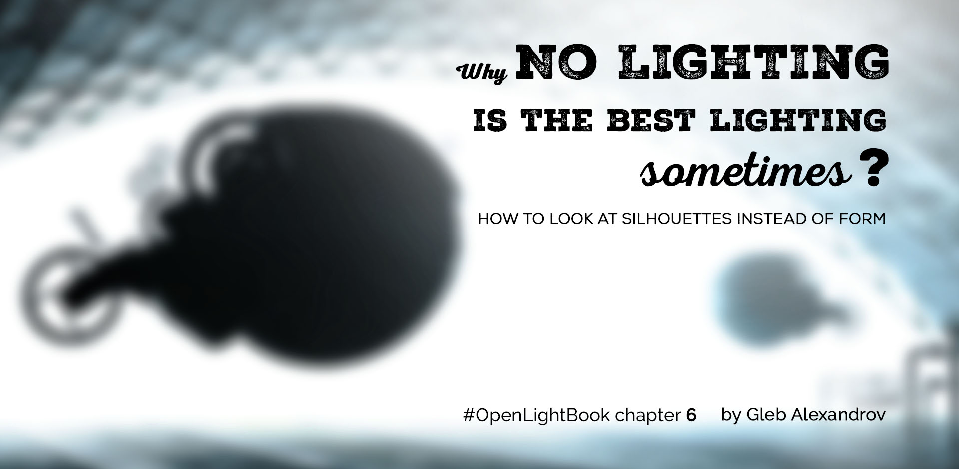
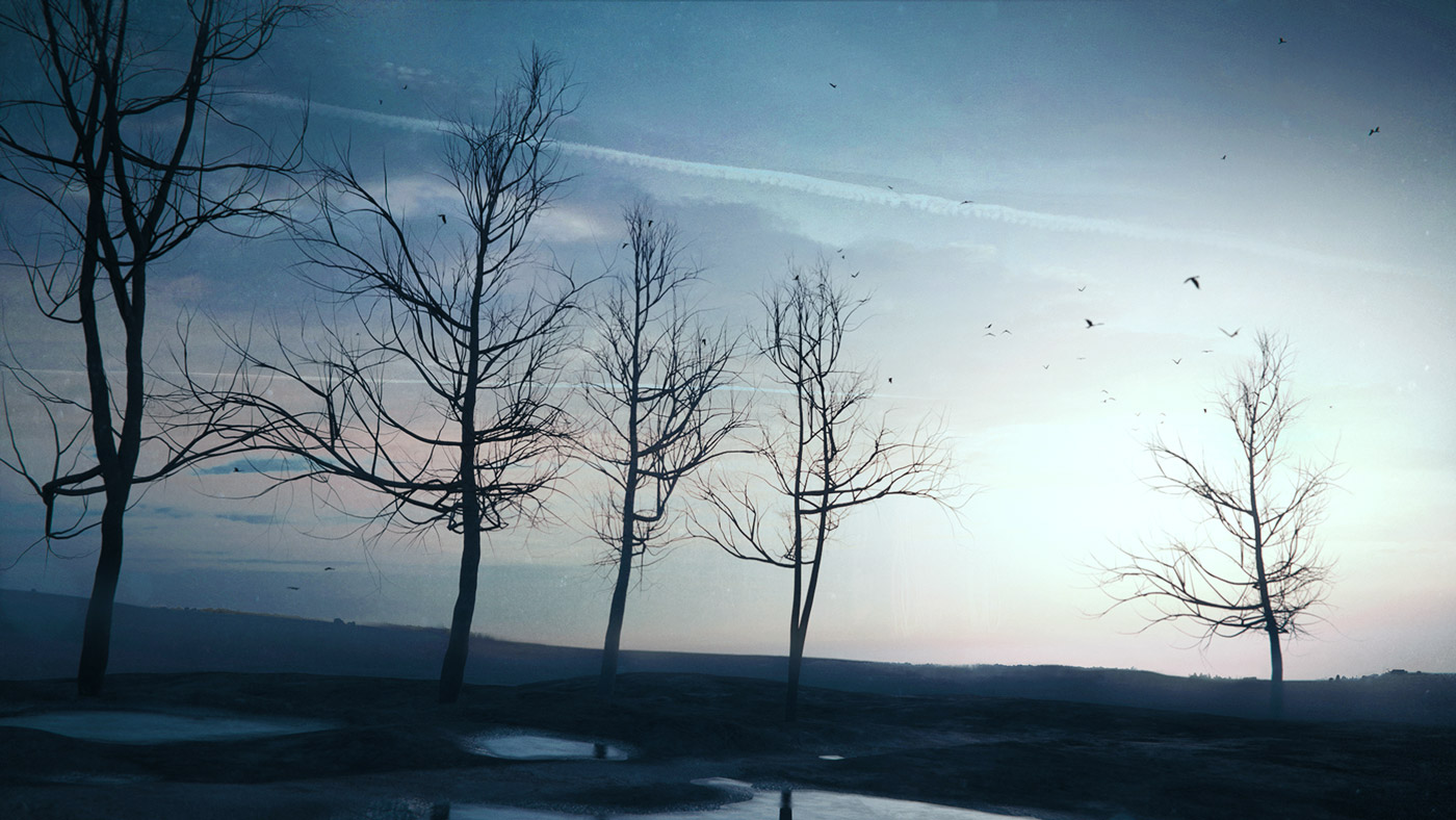
Curiously, leaving a figure unlit is sometimes the best lighting setup you can imagine. For me, it was one of those aha! moments when I noticed that lines, shapes, silhouettes can be more interesting than the three dimensional objects themselves. The question is: can you reset your vision, like creators of Limbo did?
TURN YOUR SUBJECT INTO INKBLOT
First of all, let me apologize for a cheap headline. Of course, without light there is no vision.
What I really mean is that we can refocus our vision to see the flat silhouettes instead of three-dimensional forms. Also, that we need not illuminate every object. In astonishing amount of cases, the best thing you can do is to turn your subject into inkblot. Dark and flat.
Call it two-dimensional thinking, where light = lightness.
FOCUS ON FLAT SHAPES INSTEAD OF ROUND OBJECTS
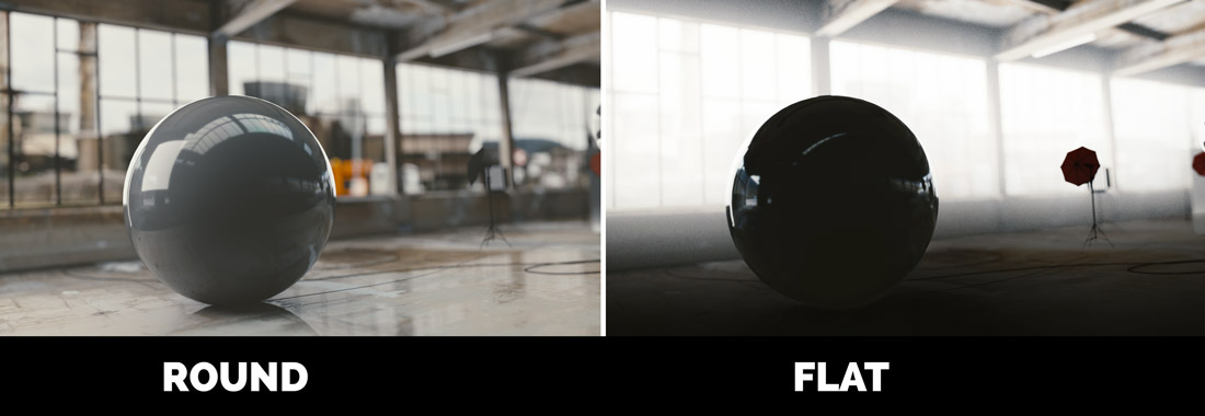
A lot of people, and I among them, look at lighting as a tool for revealing a third dimension of the art we make.
There’s a fairly straightforward explanation for this: for CG artists it’s natural to emphasize the the depth and the physically-based material and light interaction. If they just drop it, then it would feel almost like they dropped their greatest strength.
Meanwhile, photography and film industry were using 2D techniques like silhouette for ages.
That may sound obvious, but we may as well learn to see the outlines, the contrasting shapes and the value.
OPERATING MANUAL FOR SILHOUETTES:
1. Leave the subject in darkness
2. Forget about materials
3. Focus on the flat shapes
KEEP IT SIMPLE, STUPID
Sobering truth is that the ability to keep lighting simple is far more valuable, than the ability to build a multi-layered complex stack of crap.
Keep it simple, stupid – viewed from my perspective, that principle could be applied to everything we do. And what a shame that I follow this advice on a rare occasion.
Making art? Try making it using minimalist approach. Shapes, lines, contrasting blobs – is it enough?
It was one of those days when I had spent a whole lot of time on setting up the multi-layered lighting for my image just to see how terrible it became. Having come this far, I was tempted to leave everything as it is, but eventually I ended up starting from scratch.
And you know? Almost no lighting for the major part of the scene was the solution.
Interestingly, no lighting is also a good starting point in setting up any type of lighting. Enable one light at a time and look carefully. Maybe you will see that it’s time to stop.
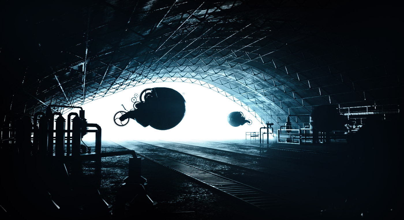
USE HIGH CONTRAST PLANES TO ENHANCE THE DEPTH, LIKE IN LIMBO
Have you ever played Limbo? Like most games with impressive visuals, it features very well-thought use of lighting. Its aesthetics is based on the separation of the image planes, that is emphasized by a black-and-white picture.
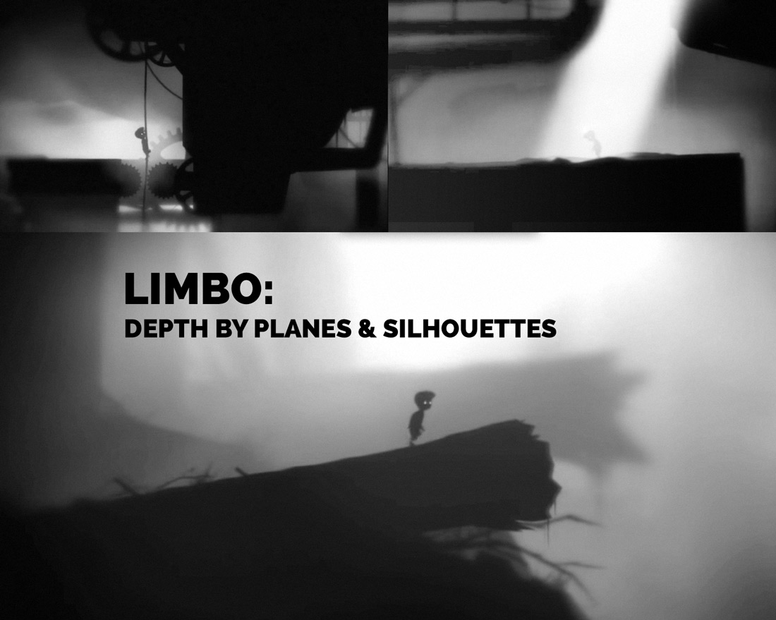
While the backdrop drowns in a grayish fog, the hero and the foreground remain pitch-black. That contrast creates a very stylized, yet visually appealing lighting situation.
Ironically, when a half or the scene receives no lighting whatsoever, it still retains the impression of a 3d depth. This is pretty good evidence that the light and material interaction, and the roundness of 3D forms is not a requirement for the depth perception.
Of course, by playing this awesome game you can tell that the parallax effect separates the background from the foreground as well. But that’s another story.

BONUS TIP: WOLFGANG METZER’S EXPERIMENT
James Elkins in a brilliant book How to Use Your Eyes describes the experiment of Wolfgang Metzer, who put volunteers in uniformly lit rooms without shadows and gradients. After some time spent in this dull environment, the volunteers reported strange things going on with their vision: descending darkness and “gray clouds”.
Interestingly, when the brain has no information to process, it automatically shuts down the vision.
LIGHTING OPEN PROJECT
This project is my way of writing a book, with your interest and support.
Every week I publish the tutorial, touching some aspect of digital lighting. Work in progress and other exciting stuff goes straight to social media. So be sure to like (on Facebook) and follow (on Twitter).
I want to keep this project open in terms of communication. I need to hear your voice, so please leave a comment and tell me, what do you like/dislike about the article, and what do you want to see in THE NEXT one.
Let’s keep it open and make this book together.
LET’S DISCUSS YOUR RENDERS!
Show me your silhouette render and I will gladly provide a feedback (honest, of course).

Pingback: Why No Lighting is the Best Lighting Sometimes?
Jeffrey Wilson
i fail to understand how this has been up for 14 hours and there are zero comments. Perhaps given what i know about the blender crowd in general the path of what you know and how they / we are going to apply it to what our goals in blender are is not so clear. I get it but I am devoting all of my time to absorbing for the next six months. Those who want to create 99.9% of blender peeps might be struggling with application. Impressive images need even more impressive, Short how its done. Maybe I need to put some more thought in this. Thanks no the less gleb, I like the effort.
Gleb Alexandrov
Jeff, now there are two comments, and that’s encouraging. Previous post with Q&A, at the other hand, has got a substantial amount of comments. And it was meaningful and enjoyable conversation. So I suppose people are there but they are hiding at the moment. 🙂
Oliver
Do you plan on doing another open Q&A session at some point. Last time you gave me some brilliant feedback and I feel I really benefited, so if you could that would be awesome. Thanks for the useful tips as always!
Edit: Sorry, my bad. I just found the one you did just a few days ago. Unfortunately that one slipped past me.
Gleb Alexandrov
Yes, Oliver. I’m going to do another Q&A very soon. Moreover, I’m also hoping to do a podcast: you post questions on Twitter using #AskGleb hashtag, and I’ll answer them.
Oliver
Cool thanks! I’ll be there!
Light Bwk
There is another thing that plays a big role in your “no light” discussion. That is the value difference. I have a crazy node setup that I use to see HSV and RGB of an image. It is hard to comprehend an image by either Hue (color of color), Saturation (the amount of hue) alone. Only value provides enough information. That’s why monochromatic TV is quite awesome. That’s also why I don’t like a lot of Blender themes. 😛
Gleb Alexandrov
Yep, that’s my point of view too. The hue is the most evasive thing, contrast by hue is a very weak type of contrast indeed. The saturation comes next in terms of strength, and the value is a champion, hands down. Black and white photography ftw!
Light Bwk
Contrast by hue using the warm to cool color relation can be quite powerful as hue shift is easier to blend.
Russ
worth watching just for the nuclear explosion !
Gleb Alexandrov
Just like Terminator 2: Judgement Day movie.
Hohenheimsenberg
I did this a couple of weeks ago, thinking in shapes. But people don’t seem to like it :(.
Gleb Alexandrov
Actually, I think that can be a very nice render after a few tweaks. Good job! Here is my feedback:
1. Composition-wise, it’s better not to place the subject in the dead center, but rather move it to the right or left third. Also I would zoom in a little bit to reveal more of a character.
2. I would add some color to it, to unite the composition and create a certain mood.
3. The next step is to add some air and volumetric light.
4. And, lastly, I would darken the overbright areas and add a broken pieces of concrete to enhance the silhouette of the arch.
Thank you for sharing your art with me, I appreciate it!
Hohenheimsenberg
No, thanks to you and your feedback, I appreciate it.
Now that you mention volumetric lighting that would be a good tutorial.
Anyway lets see what can I make.
ja li
Gleb, thanks for all the great work you are sharing. For this tutorial and going forward, would it be possible to share the .blend file so it can be studied? Thanks.
Gleb Alexandrov
Thanks mate. I’ll publish .blend files a bit later on down the road. Because right now they are too messy, and need some love before publishing. 🙂
Alex Kelly
Interesting discussion Gleb. I don’t have anything to add right now but like to see where you take this theme.
Boldozofuriozo
Thanks for the tutorials Gleb. How can I make more realistic trees, than I can create with sapling add-on?
FNHGMN
hey,
what do you think ?
Gleb Alexandrov
Wow, very nice abstraction, like it! I see that you get it.
I would slightly move elements around to balance the picture (now the left side is a bit heavier than the right side), and also I would made the main sphere bigger, to randomize an image a little bit.
Thanks for sharing!
Finn Hagemann
hey its me again ! i´ve created an other example ! i think that supports your statement 🙂
Gleb Alexandrov
yep. while this lighting setup implies that 90% of the image is pitch black, it looks nice and meaningful
Seth Crandall
What do you think about this?
Gleb Alexandrov
Seth, thanks for sharing your work with me! Love the colors and the feel of the image. For my taste, I would play with a contrast to separate the figure from the background even more.
Seth Crandall
alright, thanks!
Mason Menzies
haha! i love how your “Example render” is like 200x better then anything i could do xD fantastic as always!
Lcq92
Hey Gleb, I just rendered a road using only a background plane as light. (so it’s kind of a backlight, I guess) And with the usual post-proccessing I also added a Sobol Filter node ! And I think it really opens to a new style in Blender renders, check it out !
Gleb Alexandrov
woah! that’s indeed very interesting post-pro style (and the picture itself is nice composition-wise). I don’t often see this type of outlines. thanks for the tip!
Lcq92
Hey Gleb, I finished working on a 15secs clip of the above image, and I would love to know what you think of it ! (I removed the abstract post-prod) and PUT IN 50FPS 🙂
By the way the rain on the floor is all procedural, and was the most hard thing to make. (the first step of the process was creating this ; see, procedural.)
https://www.youtube.com/watch?v=v5Kso07S9w8
Gleb Alexandrov
Very pleasant color choice!
I would prefer a bit slower camera movement – as if it’s shot with a real camera. Other than that – I think that’s cool (especially procedural rain effect).
Lcq92
Thanks Gleb ! I would have probably made the animation longer if it wasn’t for the long render time 🙂